New & Noteworthy
Stay up to date with news, highlights, & features from across Freeman's.
Stay up to date with news, highlights, & features from across Freeman's.
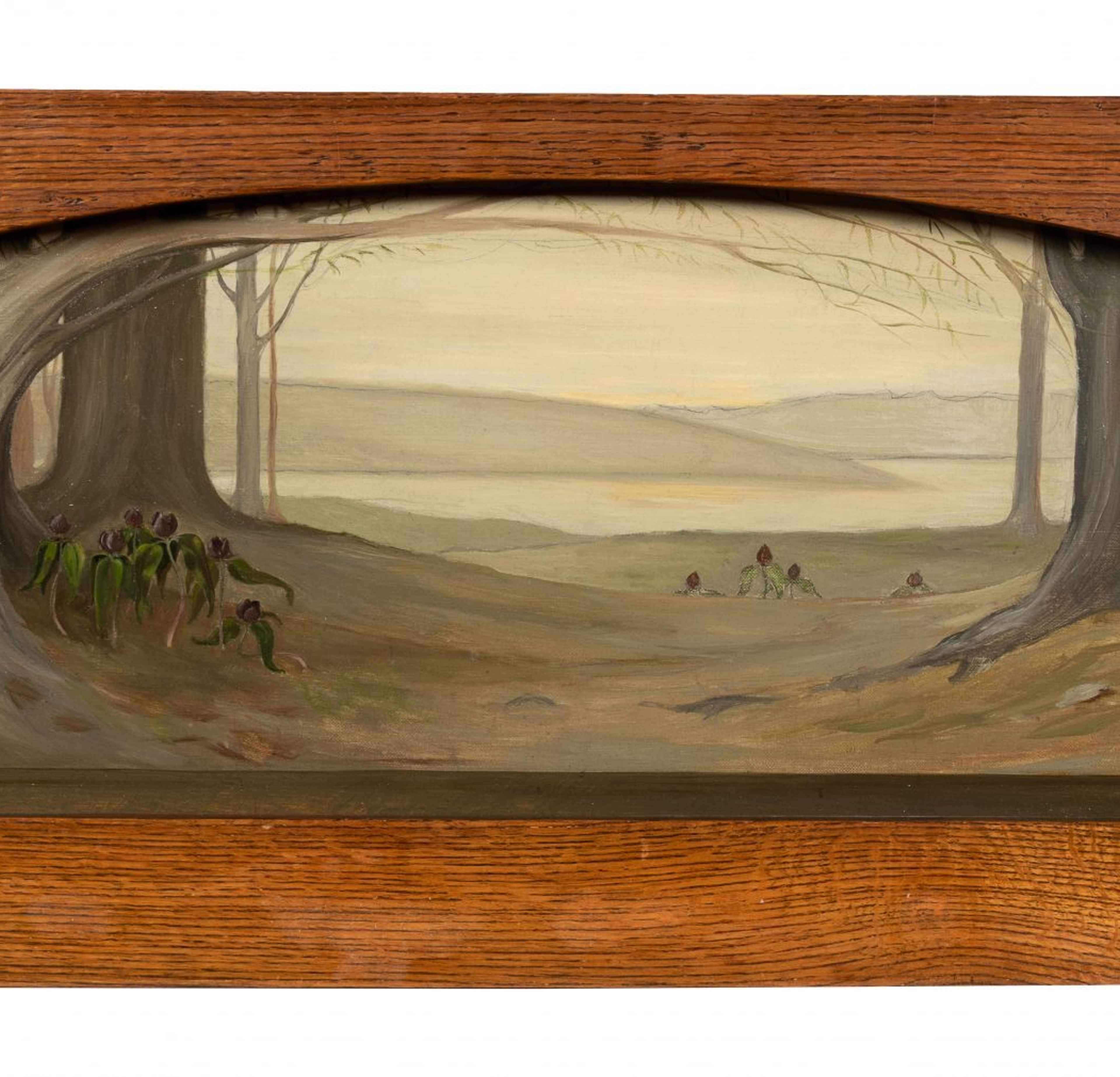
Painted in 1912 by a young Grant Wood, Decorative Landscape with Crocuses was created as a fireplace overmantel for the home of Charles and Kate Loomis of Cedar Rapids, Iowa. Charles Loomis and his brother ran a major construction company in the community. Wood embraced this tradition, creating works such as Fanciful Depiction of the Roundhouse (1920), Phantasy of Spring (1921), and Overmantel Decoration (1930). These artworks were similar to his panoramic stage backdrops for community theater performances, which he produced well into the early 1930s. In 1909, between his junior and senior high school years, Wood traveled to Minneapolis to enroll in summer classes offered by The Handicraft Guild of Minneapolis, Minnesota. Director and Instructor Ernest A. Batchelder taught the School of Design and Crafts’ Summer Session. It was during this time that Wood further immersed himself in the ideals of the American Arts & Crafts Movement, as a disciple under Batchelder. Batchelder was an important advocate of the English Arts and Crafts style and taught on the principles of decoration rather than imitation, tenets Wood readily absorbed. Wood later co-founded the Loomwood Craft Shop with Kate Loomis in Cedar Rapids, Iowa in 1911 and the shop stayed in operation into 1913. Likely as part of his work at the shop, Wood executed the present artwork. In Grant Wood and Marvin Cone: Artists of an Era, the author Hazel E. Brown states that Wood helped Kate Loomis, a Cedar Rapids resident, “…decorate her home, and over her mantel in an oak frame he placed his first signed painting—jack-in-the-pulpits in tree roots.” (H. Brown, Grant Wood and Marvin Cone: Artists of an Era, Ames, Iowa, The University of Iowa Press, 1972, p. 10) Despite the confusion of flower names, a label on the verso of the present artwork further attests to this being one of Wood’s first signed paintings. In fact, the flowers depicted are likely neither crocuses nor jack-in-the-pulpits, but instead may be prairie trilliums. Native to the midwestern states, prairie trilliums are shade-loving flowers that emerge in the spring, usually in woodlands. Wood was familiar with the flora and fauna of his native landscape and had ample opportunity to observe the flowers, which are characterized by each having three maroon petals and three green leaves perched atop a thick stem. The young artist shows the flowers in the bare forest earth, protected by an arching stretch of leafless branches that extend from trees to the left and right of the composition. Beyond the trees and flowers, a vista opens of patterned, curved hills. The curve of the painted branches and hills is echoed by the physical curve of the oak frame’s upper molding. The repetition of form, use of pattern, and simple composition attest to Batchelder’s teachings, which Wood had so recently learned. The artist would maintain these principles throughout his career, and the present painting is an early precursor to his later iconic work. Grant Wood (American, 1891-1942) Decorative Landscape with Crocuses, 1912 oil on canvas mounted on wood signed Grant Wood and dated (lower right) 15 x 34 inches. Property from the estate of Nancy Holmes, Cedar Rapids, Iowa Provenance: Charles Calvin Loomis and Kate L. Terry Loomis, Cedar Rapids, Iowa G. Stewart Holmes, Cedar Rapids, Iowa James T. Holmes, son of the above, Cedar Rapids, Iowa Exhibited: Cedar Rapids, Iowa, Cedar Rapids Art Association, Public Art Gallery, An Exhibition of Paintings and Sculpture by Mrs. Charles Dieman, Marvin D. Cone, and Grant Wood, April 14-28, 1920, no. 32, An Overmantel Decoration (Possibly) New York, Whitney Museum of American Art, Grant Wood: American Gothic and Other Fables, March 2-June 10, 2018, pp. 94-95, 203, pl. 8, illus. Literature: Hazel E. Brown, Grant Wood and Marvin Cone: Artists of an Era, Ames, Iowa, 1972, p. 10 James M. Dennis, Grant Wood: A study in American art and culture, New York, 1975, p. 21, 23, fig. 6. This painting will be included in Joseph S. Czestochowski’s forthcoming catalogue raisonné of the artist’s work by International Arts® at www.catrais.org. Estimate: $30,000-50,000
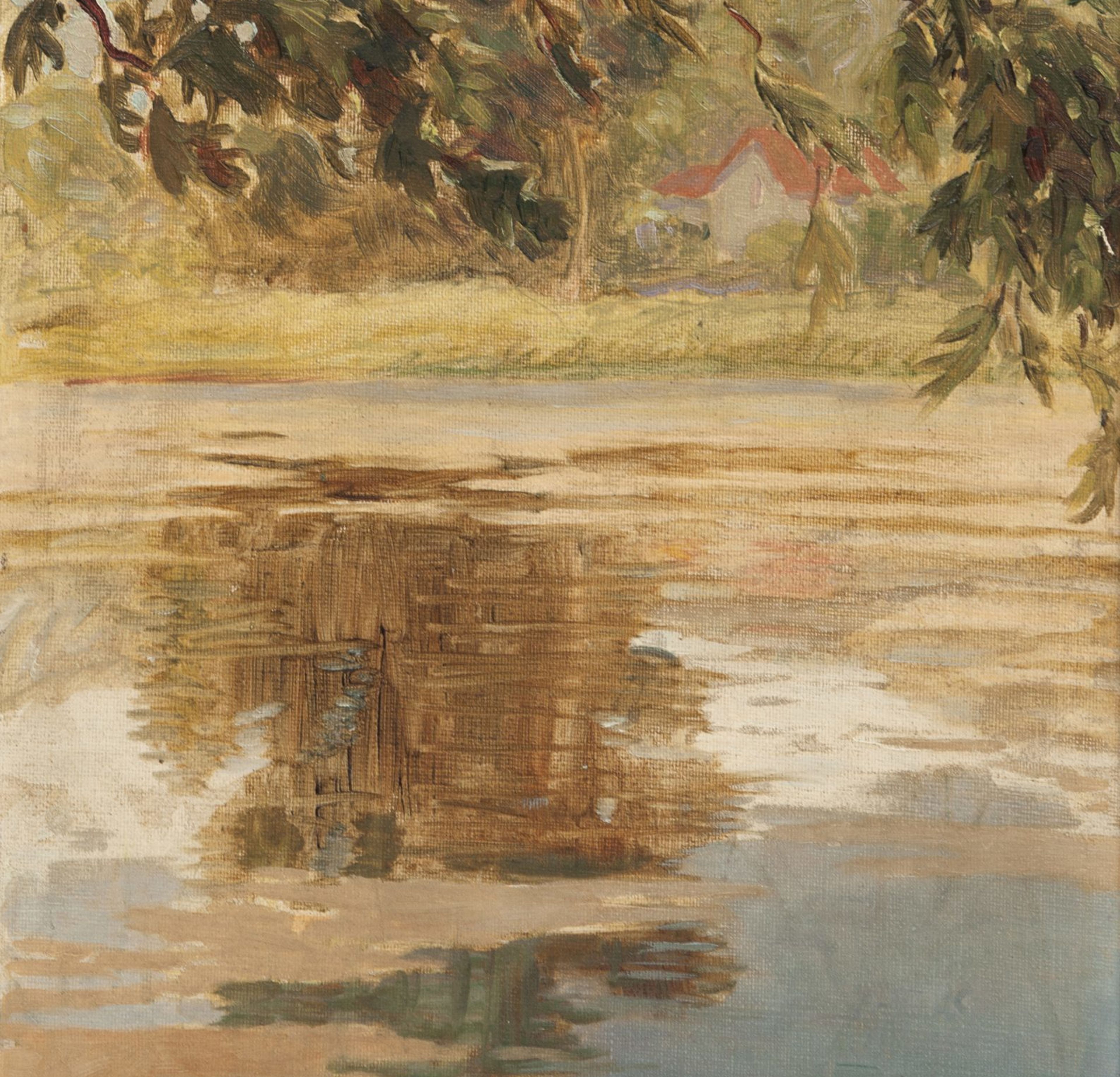
Reflections, Ville d’Avray stands as an early work by an artistically evolving Grant Wood. Prior to developing the unique style that gave rise to such iconic works as American Gothic, Wood primarily worked in an impressionistic manner. The young Wood was part of a generation that received training when impressionism was the dominant method of painting. After studying at various Midwestern art schools, including the Art Institute of Chicago, Wood and his friend Marvin Cone traveled to France in the summer of 1920, in order to continue their studies. It was during this trip that the present artwork was created. The pair of young artists settled in Paris, but traveled to the various suburbs surrounding the city, including Versailles and Ville d’Avray. The artist Jean-Baptiste-Camille Corot, a progenitor of impressionism, was a former resident of Ville d’Avray. Corot’s home included a pond that Wood painted several times, including the present artwork and Ville d’Avray, Paris, 1920 (Cedar Rapids Museum of Art, Iowa). The two paintings were exhibited upon the artists’ return from Paris in Paintings of Paris by Grant Wood and Marvin D. Cone, Public Library Art Gallery, Cedar Rapids Art Association, Cedar Rapids, Iowa, November 10-20, 1920. Cone executed a companion piece to Wood’s, titled Reflections, Corot’s Pond, (Cedar Rapids Museum of Art, Iowa), completed on the same June to August trip. It was on this same trip that Wood also introduced Cone to Winnifred Swift, and the two were married in 1921. According to Cone’s diary from the trip, Wood primarily worked outdoors, typically over the course of a few hours. The paintings were small for ease of transport and stylistically loose. However, Wood’s meticulous temperament prevented him from fully embracing the spontaneity of impressionism. Structure and form reigned supreme for the artist, with light and color of secondary importance. This emphasis on structure can be seen in Reflections, Ville d’Avray. Strong horizontal brushstrokes delineate the reflections in the pond and divides the water and grassy bank. The close-cropped tree branches in the upper foreground partially block the distant shore with its red-roofed building, creating a sense of circumscribed privacy. It is only the free, short brushstrokes that relate the painting to impressionism and carry it closely towards abstraction. The almost decorative quality in the present work hints at the later mature style for which Wood is best known. According to Joseph S. Czestochowski, this painting of Corot’s Pond is not the Cook’s Pond in Cedar Rapids, Iowa, which Darrell Garwood frequently referred to as “Corot’s Pond” in his book, Artist in Iowa, A Life of Grant Wood (New York, 1944, p. 53). Grant Wood (American, 1891-1942) Reflections, Ville d’Avray, 1920 oil on canvas board signed Grant Wood and dated (lower left) 15 x 13 inches. Property from the estate of Nancy Holmes, Cedar Rapids, Iowa This painting will be included in Joseph S. Czestochowski’s forthcoming catalogue raisonné of the artist’s work by International Arts® at www.catrais.org. Provenance: G. Stewart Holmes, Cedar Rapids, Iowa James T. Holmes, son of the above, Cedar Rapids, Iowa Exhibited: Cedar Rapids, Iowa, Cedar Rapids Art Association, Public Library Art Gallery, Paintings of Paris by Grant Wood and Marvin D. Cone, November 10-20, 1920, no. 12, (possibly) Estimate: $15,000-25,000
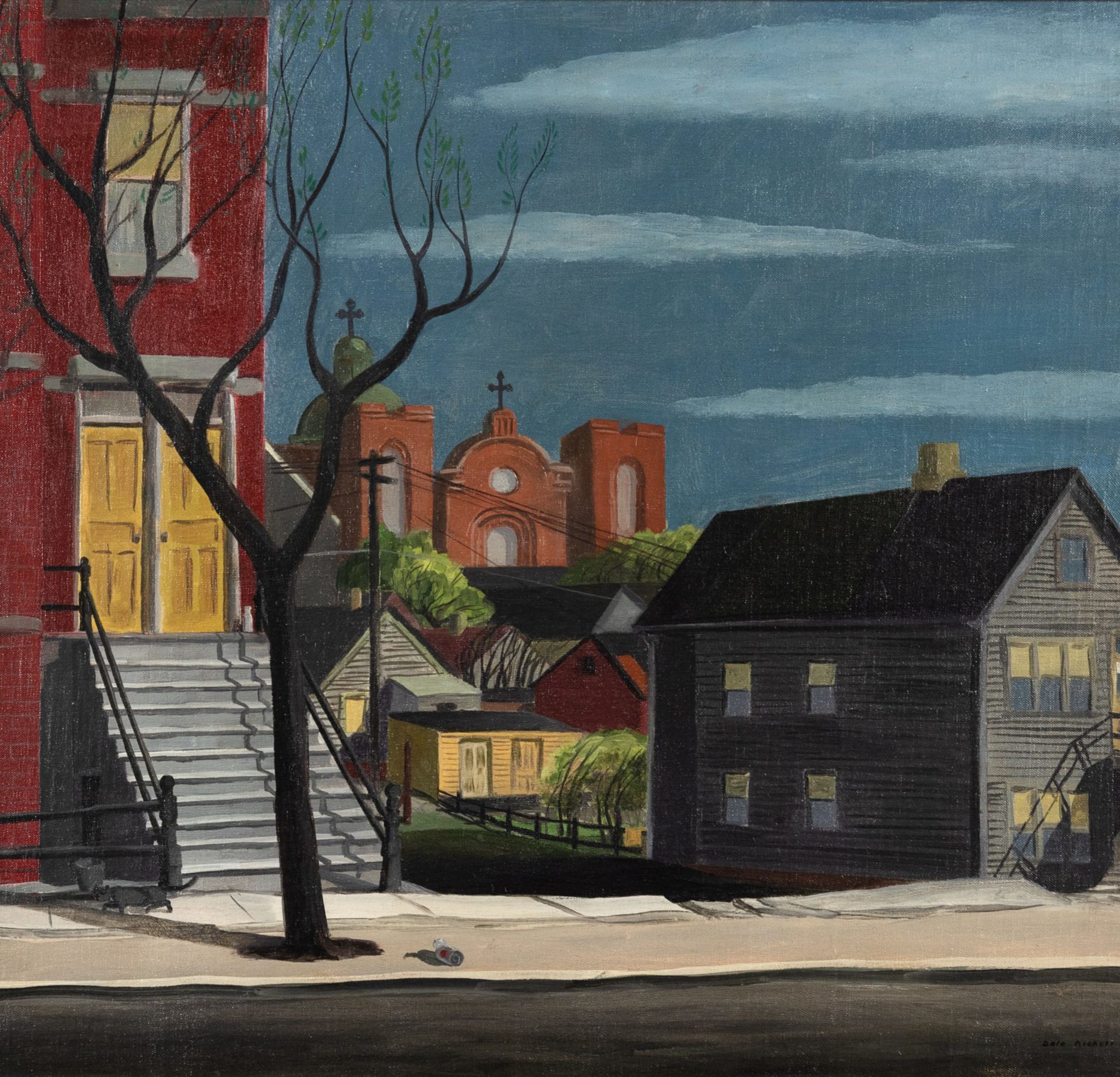
Chicago, 1934, stands as an early, unique example of Dale Nichols’ artwork. According to the Curator of Bone Creek Museum of Agrarian Art, which holds an extensive collection of the artist’s work, Chicago is distinctive for its urban setting, as Nichols is best known for his bucolic scenes of countryside red barns (Amanda Mobley Guenther, July 16, 2020). The painting is accompanied by a handwritten letter on Nichols’ personalized stationery, from the artist to a Mrs. Edwin N. Johnson. The letter is dated November 24, 1946 and in it Nichols testifies that Chicago is one of the very few paintings he executed “on the spot.” He was taken to the location by the illustrator Benjamin Stahl (1910-1987), and Nichols goes on to say in the letter that “The picture does not show the rather tough little boys that crowded about us while we worked.” Written 14 years after the artwork was painted, the artist cannot recall the exact location of the scene (“on the north side somewhere”). However, Chicago likely depicts an area in the Bucktown neighborhood. Possibly painted on the 1800 block of North Marshfield Avenue, St. Mary of the Angels Roman Catholic Church can be partially viewed from its location at 1850 North Hermitage Avenue. The two houses depicted in the painting still stand, but the view of the church through the stretch of green grass is blocked by two recently built condominiums. The artist would have to have stood facing slightly northwest for the angle and view of the church. Although Nichols simplified the ornate architectural details of the church, the two square towers and the rounded, vertical extension of the center portion of the front façade remain distinct. Both the dome and center portion of the front façade have been remodeled over the years, including brickwork that replaced the rounded extension. Chicago captures the particular architectural vernacular of the city’s neighborhood. Wooden houses like the one on the composition’s right were once common in Chicago. These were gradually replaced with dwellings such as the two-flat brick building on the left. The steep, elevated front steps of both homes speak to the Midwest’s deep winter snows and the city’s residents’ ingenuity to squeeze ever more living space in a small footprint. The building structures, with their rectangular blocks of windows and walls, and triangular roofs, reveal Nichols’ method of arranging geometric shapes to produce a formal composition. The artist also believed in using a single light source, typically the sun. Strong, dark shadows are cast by the branches of the tree and different elements of both houses. When transforming his geometric blocks into “realistic” objects, Nichols tried to paint them abstractly, in a way that expressed their inner reality. Although Chicago is at face value a painting of a city block, the structures and shadows convey a brooding, hard-bitten atmosphere populated by unseen residents. The artist’s artistic language is crystallizing into the formal elements for which he was later to become famous. The same year Chicago was produced, Nichols created his most famed painting, End of the Hunt (Metropolitan Museum of Art, New York), which became the basis for all his future works.

Ed Paschke (1939-2004) was the quintessential Chicago-based artist of the Imagist generation which emerged in the disruptive period of the late 1960s. His work centered on what critic James Yood called “The human figure under duress” as he described the salient theme of Imagist art. Other prominent Imagists mined the psychological surrealism of lowbrow popular culture. Ed Paschke relied on photo imagery drawn directly from mass media. He was interested in the adversarial relationship between individual identity and culture (which he defined as “symbols, metaphors, icons…and their baggage of referentiality”). He did not have a program, he was too inventive, the master Rule Breaker. In retrospect we see that he was working the grand theme of our age: The loss of self and hopeful redemption. His early work centers on outsider identity, using ironic, comic exaggeration of figures and their costumes (wearable defenses), freaks and their anatomical damages. These characters were the excluded ones, while the viewer is the eager insider observer: a little smug, a little horrified, a little amused, a little sympathetic, like a visitor at a zoo or an extreme entertainment event. As Paschke’s work develops, the viewer is gradually absorbed by the surrounding, immersive, fractured context, like electric flashes, in an abusive culture. In his late work, the individual is replaced by mythic icons of public power, layered with color shards, as if torn from signs. Outsider and insider are then mingled and subsumed. The individual, the autobiographical, the essence of human identity, vanishes. Or it may seem, but Paschke was not a nihilist. He chose ambiguity, contradiction and paradox over finality. Paschke held to a Law of Opposites, embracing the contradiction of one thing evoking its opposite alerting us to the “baggage” of ambiguous referentiality. That holds our attention and draws us close. We want to see Paschke’s art not only from the usual distance but also up close. We need to savor its surfaces and the paradox of image portraying the loss of self, and method asserting the redemption of self. Ed Paschke was a superb craftsman. His technical mastery of drawing and painting is evident on every inch of surface. His confident touch, the featherweight delicacy of his method and the gentle assurance of his marks reveal his skill and his patient, generous, temperament. It is as though he was in private conversation with his art and its characters. He used sponges to apply and rub paint, tiny pointed brushes, pure pigments straight from the tubes and ink, crayon, and pencil that scarcely touched the surface. The canvas -and its helpless inhabitants- never felt his hand, or if they did, it was a caress, a kiss, a protective palm, a slight tap. The surface reveals Ed’s truth. There is his love and empathy, to protect and rescue each of them and each of us. Boots, 1972, shows how visual concentration guided his pencil and crayons to an exacting, sculptural rendering that nevertheless retains a loose, almost casual, fading of edges. Thousands of bundled lines overlap, encircle and weave. They accumulate without effort. The boots are shown as in-use by an invisible wearer. Who? One thinks of bizarre militarism, maybe a crazed officer or costumed prankster. Elongated, too narrow, the boots convey oddness and tight discomfort. They are restrictive physical and psychological prosthetics. But the laces don’t bind. Instead they seem fluffy, almost like luminous chrysalises about to burst into butterflies — and freedom. Sky Blue, 1994, represents Paschke’s moving on from the large celebrity or historical icon portraits of a few years earlier (such as his Elvis and Lincoln). Here Paschke reinvents a human scale generalized androgynous face overlaid with tattoo-like symbols of little chicks. They may be either dreaded or soothing chicks but they fill the head. (they may refer to his father’s inspiring carvings of birds). On the upper right a larger chicken without a wattle is neither fully hen nor rooster. This ambiguity leads us again to Paschke’s paradoxical law of opposites that resist efforts to explain his imagery as a simple narrative. Paschke employs wide ovals and lines to merge with the painted head. Together they suggest the five senses. Other symbols float nearby. It’s an uncertain private dialogue about personal identity happening in broad daylight. The paint application is more varied in this work, sometimes thick, vigorous; sometimes water thin and dotted, evoking the presence of studio hands-on working and experiment. Sky Blue shows how Paschke’s commitment to inventive at-the-moment problem solving was guided by his career-long maxim: “Show life in the picture plane. Tracer, 1989: The jittery, glowing face of the iconic comic strip Dick Tracy is surrounded by a TV screen and to its left a full color mirror image (also indicated by reverse numbers on the frontal face) of a wannabe Dick Tracy, a Tracer. The duo reflects the essential oneness of the two faces. The merging of icon with “the common man “ suggests the projection of self into cultural identity or the absorption of self by a fictional, flickering icon. The delicately painted surface is a clue to Paschke’s encouraging empathy for a Tracer, the character under a big 1940s gangland Fedora. Spirit of Power, 1989, is a spectral image of a gun, one of many that Paschke made at this time. It’s an icon of gang violence and societal authority and defense, complicated further by the religious allusion of the INRI inscription and a cross. Meticulous rendering in several media, applied in succession, invite a visual delayering, as if peeling away the marks will reveal meaning. At this time Paschke was drawing over washes with ink dots that mimic his method of painting with the tips of small brushes, accumulating tone and illusion without obscuring the illumination from under-layers. There is a ritualist’s fondness for repetition in his method. It asks the viewer to participate in drawing and to contemplate the deceptive aura of an icon of sudden and terrible violence. -William Conger, Artist; Professor Emeritus, Art Theory and Practice, Northwestern University
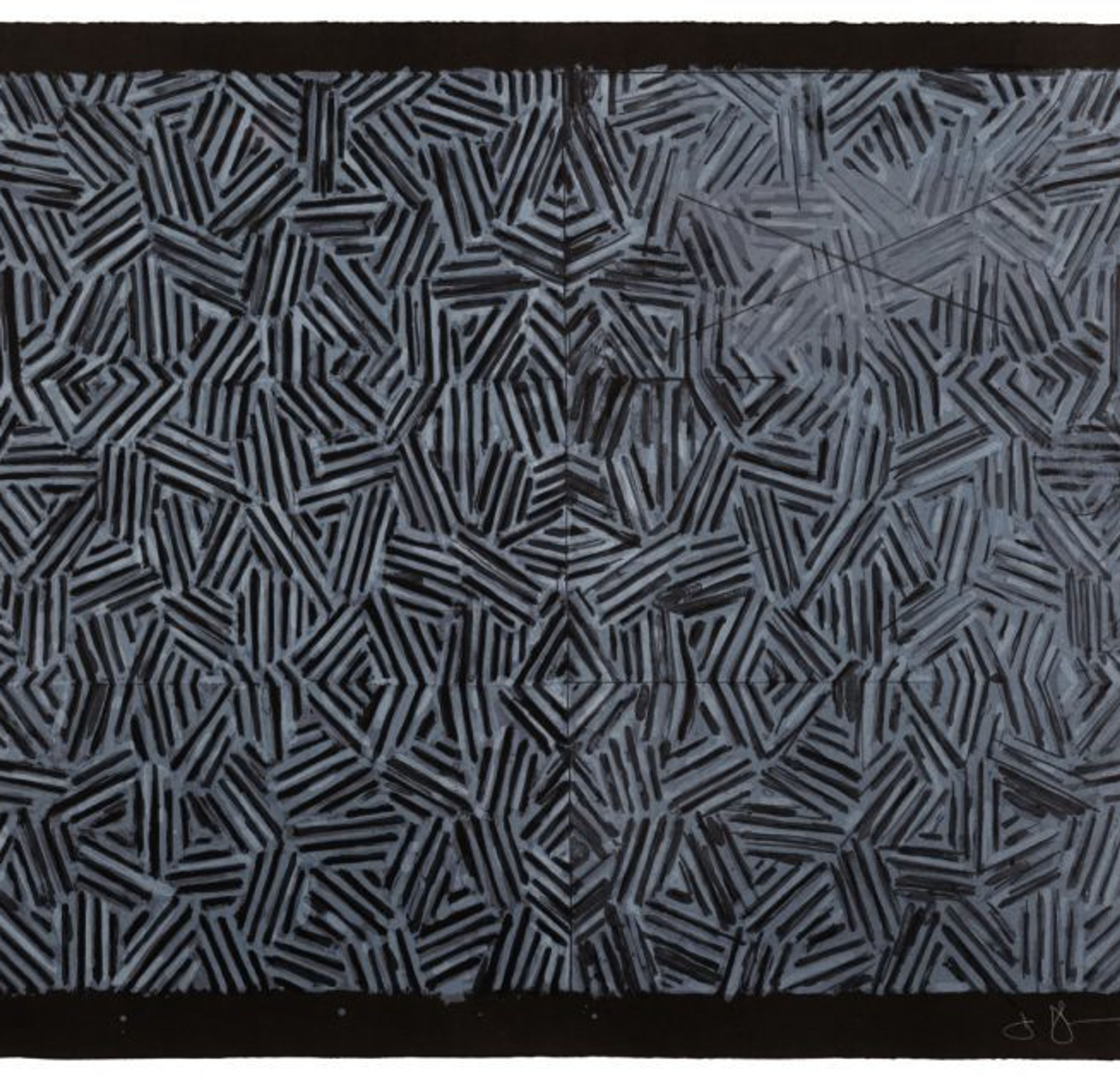
I only saw it for a second, but knew immediately that I was going to use it. It had all the qualities that interest me – literalness, repetitiveness, an obsessive quality, order with dumbness, and the possibility of a complete lack of meaning. -Jasper Johns, on glimpsing the crosshatched pattern for the first time on a passing car – a pattern that permeated his work for the next ten years Based on a painting of the same title from 1974 on which black encaustic hatching appears on a white field, Jasper Johns’ Corpse and Mirror printed at ULAE in 1976, was an ambitious undertaking from the start. It was not his first crosshatch print and would not be his last, but the complexity of the composition is pushed to the edge through the stark use of a black ground. The title, Corpse and Mirror,refers to the game cadavre exquis or exquisite corpse invented by the French Surrealists where a player makes a drawing on a piece of paper which is then folded over so that only the edge is visible to the next player who continues, thus producing a continuous but not logically linked image. Here, Johns furthers the idea of this game through the mirrored element, his signature crosshatching and of course his sophisticated mastery of printmaking. The printing process involved twelve lithographic plates each printed on a hand fed offset proofing press resulting in six individual yet related fields. The almost indecipherable differences in his treatment of each of the six sections include a light pink wash, adding violet, yellow or blue to the white pigment, but doing so in such a subtle way that the eye cannot immediately process the differences on the black background. This is where Johns’ deep knowledge and understanding of printmaking and compositional intricacies is most evident. For Jasper Johns, the 1970’s hailed a move to experimentation with the abstracted crosshatch theme in his paintings as well as his prints. It has become one of the central themes in Johns’ canon and is expertly executed in the work presented here. The complexity and calculated sophistication in technique and composition are a hallmark of the artist in every medium in which he works. October 2, 2020, Prints and Multiples Auction Lot 6 Jasper Johns (American, b. 1930) Corpse and Mirror, 1976 lithograph in white on black German etching papersigned, dated, and numbered 15/58 in white pencil28 3/4 x 30 1/2 inches. Property from a Private Colorado Collector Literature: ULAE 168 Estimate: $20,000.00 – $40,000.00
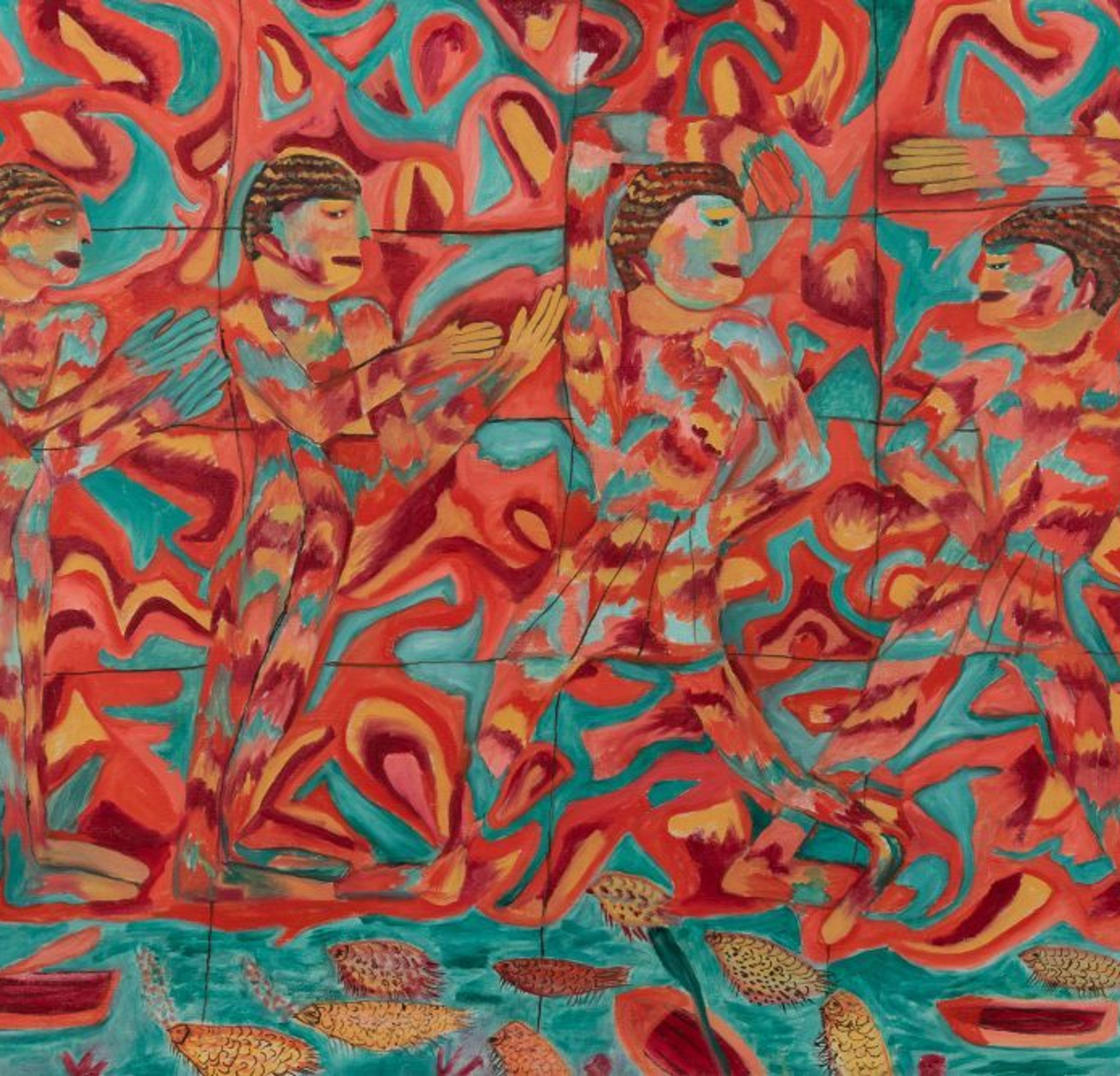
Suellen Rocca was an artist as well as instructor, collector in addition to curator. Her distinctive compositional arrangements and initially loose mark-making set her art production apart from her peers, a generation of artists colloquially known as the Chicago Imagists. Likewise, she taught in schools and colleges in and around Chicago for a range of age groups from diverse backgrounds, including students at The School of the Art Institute of Chicago (SAIC), The Jane Addams Hull House, and Elmhurst College, among others. Rocca’s personal collection included the present cache of prized works created by her friends and fellow artists— often obtained through trades and purchases made amongst them— and she stewarded these works just as she dutifully attended to Elmhurst College’s art collection, where she served as Curator and Director of Exhibitions since 2006. Boasting over 150 works, Elmhurst’s collection echoes Rocca’s own, since its growth is, in part, a result of donations and gifts made directly by artists. Rocca got an incredibly early start in the arts, and followed an esteemed trajectory throughout her career. A bit of a wunderkind, her artistic talents were recognized by a grade school teacher who recommended she attend children’s art classes at The Art Institute of Chicago, and by age 16, she was entering art school on scholarship at SAIC. It was there that instructors nurtured the development of Rocca’s eye, hand and personal collecting habits, and after graduating, she and a group of like-minded friends and fellow SAIC classmates—including Gladys Nilsson— formed an exhibition group. They named themselves Hairy Who, and in a natural evolution from the informal, generative and also stimulatingly competitive relationships forged in art school, they began mounting now infamous exhibitions at The Hyde Park Art Center on Chicago’s Southside. Together, Rocca and her peers created a bold context for their work, framing it within ornate exhibition designs accompanied by zany ephemera. The control and autonomy their collective, communal efforts yielded was a form of mutual aid—their exhibition group both emphasized and benefited Rocca and each artist as individuals. The critical acclaim Rocca and the Hairy Who garnered is still unparalleled when considered within the context of Chicago’s history of art. In the greatest form of flattery, they inspired subsequent generations to follow in their footsteps, beginning with exhibition groups such as Nonplussed Some and False Image, which included Phil Hanson and Roger Brown. In this way, Rocca’s wide-ranging and lifelong commitment to the arts not only showcased her unique abilities and vision, but also supported and provided opportunities for others to make and show their own art. Thea Liberty Nichols

A native of Cedar Rapids, Iowa, the Midwestern landscape provided Marvin Cone a wealth of source material. While often grouped with Regional artists of the 1920s and 1930s, especially as he was close friends with Grant Wood, Cone did not consider himself a Regionalist. Cone’s art was not an effort to record surrounding daily life, but a blend of his values and imagination and their relationship to his unique experiences. The artist painted for himself, creating pictures that represented his own inner being. As stated by Joseph Czestochowski, “Each of Cone’s works reflects an individual moment in time and space, fixing the artist’s identity within a universal context of inevitable change.” (Joseph Czestochowski, Marvin D. Cone and Grant Wood: an American Tradition, Cedar Rapids, Iowa, Cedar Rapids Museum of Art, 1989, p. 10) From 1930 to 1937, Cone focused his gaze on the unique terrain of rural Iowa. Executed in 1934, Interval epitomizes his work from this period. The painting reveals Cone’s stylized method of breaking down landscapes into layers of component parts and using color rich with light. The composition, dominated by towering cumulus clouds, is given depth through a complex layering of forms, emphasized by the scattered smaller clouds in front of the larger cloudbank and the hazy striations of cirrus clouds above and below. The rolling hills are divided into distinct bands that recede into the background. The colors overall are subtle and evocative in their suggestion of light, which seems to emit outwardly from the heaped clouds. Two birds soar together in the lower left of the composition, accentuating the wild freedom of the expansive landscape. Like many of Cone’s paintings from this period, the scene is devoid of human life. The painting stands as a testament to the mysteries of nature, while also being extremely personal in its sense of solitude and tranquility. In Interval, Cone created a universal vision safe from the vagaries of time. “The artist does not set out to imitate nature,” Cone remarked. “Art traces an abstraction and makes it audible or visual. It symbolizes the whole of life” (as quoted in Cedar Rapids Gazette, January 19, 1938, p. 15, and May 26, 1938, p. 8). Perhaps the distinguished poet and Cone’s close friend Paul Engle, founder of Iowa Writers’ Workshop, best summarized Cone’s achievements when he said in 1960, “Marvin Cone dramatized space…He stares at the world with his hands…He has the painter’s second sight, the form seen once, then again after the imagination has redefined it” (“Portrait of the Artist as Neighbor,” Marvin Cone, A Retrospective Exhibition 1938-1960, Iowa City, Iowa, 1960, n.p.).

“When everything goes right a mobile is a piece of poetry that dances with the joy of life and surprises” (Alexander Calder, quoted in Jean Lipman, Calder’s Universe, London, 1977, p. 261). Calder’s instantly recognizable kinetic sculptures revolutionized three-dimensional art in the early 20th century. In 1926, the young artist began a seven-year sojourn in Paris, where he absorbed European Modernism and was particularly influenced by the biomorphic forms, flat planes, and primary colors used by Piet Mondrian and Joan Miró. Calder used these motifs to invent his own artistic language, constructing sculptures brimming with dynamism and vibrancy. These innovative creations include static sculptures termed stabiles, kinetic sculptures called mobiles, and a hybrid, the standing mobile, with a kinetic sculpture attached to a non-moving base. All forms delight and awe with their irregular forms, bold colors, and flat planes, harmoniously balanced to move with the faintest breath of air. LOT 63 | Alexander Calder (American, 1898-1976) Triple Cross, 1947 Executed in 1947, Triple Cross exudes a whimsy that belies its sophisticated construction. One of Calder’s standing mobiles, it reflects the artist’s training as a mechanical engineer, as well as his use of humble materials such as sheet metal and wire struts. A long thin rod balances on top of the swooping foundation and forms the basis of a chain-linked system of smaller rods. Biomorphic, metal shapes are attached to the terminal points of the rods and carefully counterbalance each other. The black base, all angles and curves, is a solid contrapuntal to the colorful, quivering construction that rests on top. LOT 62 | Alexander Calder (American, 1898-1976) Petit poteau jaune (Little Yellow Post), 1963 Created toward the end of his storied career, Petit poteau jaune (Little Yellow Post), 1963 demonstrates through balance and movement a maker who has mastered his craft. The standing mobile takes its title from the yellow “post” composed of a triangular base that then extends vertically upward. Perched on top of the post is a wire with a red, crescent moon-shaped element connected on one side and a decrescendo of wires and round forms on the other. The juxtaposition of the large red crescent moon with the smaller black and white round elements creates a visual tension that gives the sculpture a unique presence. Calder’s desire to create an art that would resonate with life led to a constant engagement with the pull of gravity, the circulation of air, and the play of chance. The stable bases of Triple Cross and Petit poteau jaune (Little Yellow Post) support an intricate system of cantilevers that give the individual elements extraordinary mobility. Together, they express a delicate vitality and strength, testaments to Calder’s ingenuity and creativity.
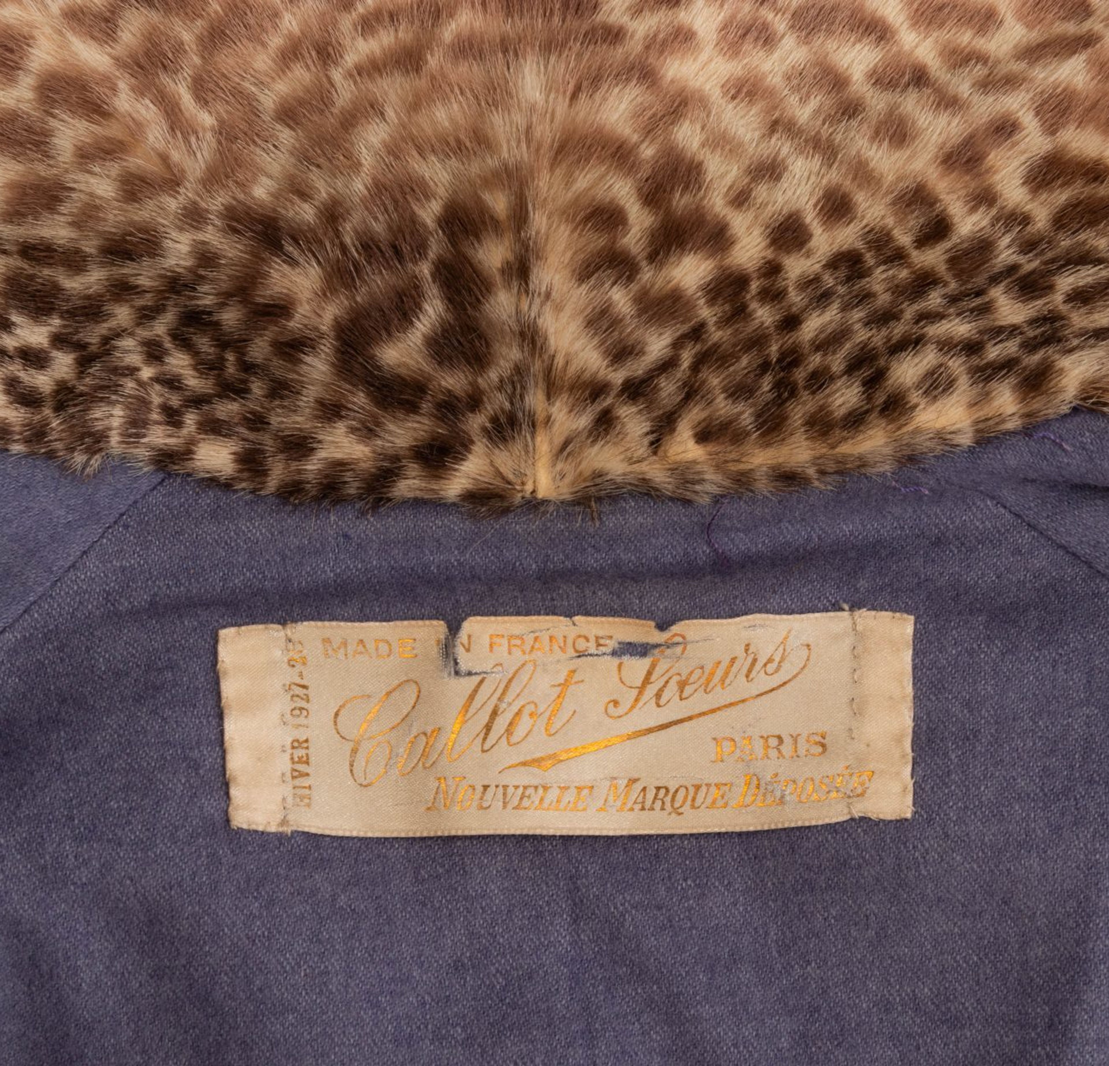
Recognized internationally for their resplendent gowns and extraordinary quality of work, Callot Soeurs are regarded as vanguards of Belle Epoque fashion. They set the standard for elegance at the beginning of the twentieth century: in 1916, American Vogue proclaimed Callot Soeurs as “foremost among the powers that rule the destinies of a woman’s life.”[1] The enterprise helmed by three sisters became the coveted label for an elite class of women, dressing modern femininity in embroidery and lace. Today, Callot Soeurs’ legacy remains understudied, but nonetheless widely recognized and collected; their designs feature prominently in museum collections worldwide and perform well at auction. Hindman is proud to again bring their work to auction this September. As the daughters of a painter and a lacemaker, the Callot sisters opened their first shop in Paris in 1879. Their business thrived selling the lace, ribbons, and lingerie that were coveted for the ornately detailed fashions of the era. By 1895, their success and acquired investment by wealthy benefactors led their business to expand into a couture house under the name Callot Soeurs. The label was operated primarily by the three eldest sisters of the Callot family: Marie Callot Gerber, Marthe Callot Bertrand, and Regina Callot Tennyson-Chantrell. Their reputation grew rapidly throughout Paris, and the 1900 Paris Exposition made them known to international clientele. Callot Soeurs became a staple in the wardrobes of society women throughout Europe and the United States, helping to usher in a new era of fashion. Fig. 1. Sale 769, Lot 1 | Callot Soeurs Leather and Fur Coat. Estimate: $1,000-2,000. The label became known for their romantic, highly ornamented creations composed of weightless layers, creating tea gowns and housecoats inspired by the Near and Far East. They abandoned the corset, eschewing the S-curve of the 1890s for a more natural feminine shape. The silhouette favored by Charles Frederick Worth — cinched, padded, and buttressed — dictated the movement and occupation of the female body only a decade prior. Marie Gerber was known among the three as the lead innovator and designer, who, skilled in draping and effortless manipulation of fabric, created dresses less restrictive than Poiret’s hobble skirts, and more understated than his theatrical orientalism. After maintaining a thriving business throughout the economic challenges of the First World War, the years following the war brought about a great deal of change for Callot Soeurs. This was a time of flux for the fashion industry as customer demands and tastes shifted; in 1920, Marthe died and Regine retired, leaving Marie as the sole proprietor and creative force during a time of enormous change for Callot Soeurs. Dated 1927, lot 1 in Hindman’s Couture and Luxury Accessories September Sale (fig. 1) seems an unlikely consequence of Callot’s earlier orientalist and Rococo sensibilities. And yet, this coat is simultaneously a continuation of their modernist tendencies and reflects their ability to respond and lead on profound shifts in fashion over just a few years. In 1916, Vogue, describing Callot, wrote, “In the housecoat, Paris has invented a real inducement for woman to stay in her traditional sphere.”[2] By the mid-1920s, Callot was offering leather coats for women venturing boldly outside into public life. Fig. 2. Sale 92, Lot 9 | A Black Silk French Couture Dress, 1920s, attributed to Callot Soeurs, in a halter style with an extreme plunging back with gold lamé hem band. Together with an Alençon lace overlay. Sold for $4,250. Callot Soeurs’ later work reflects the aesthetic revolution underway in fashion, decorative arts, and architecture. During the war, women entered the workforce in unprecedented numbers, enjoying activities and liberties they had previously been denied. The transfigurations that occurred in art were paralleled in fashion, and antiquated bodily ideals were subverted by the straight, almost tubular, figure of the “liberated and enfranchised” woman.[3]Indeed, Callot experimented with the sleeker lines, harder edges, and flattened forms of modernism, as the taste for ornamentation declined. They began to incorporate elements of Art Deco and cubism into their romantic, feminine core. “Geometric in design,” noted Diana Vreeland, “the clothes relied on the motion of living women to breathe in a shape, a movement and a sexuality into an otherwise sterile form.”[4] Madeleine Vionnet, the head seamstress at Callot Soeurs from 1901-1907, could have easily inspired the designs for figs. 2 and 3. Once a student of Callot’s, she later became an influence, and forever remained an admirer, saying, “Without the example of the Callot Soeurs, I would have continued to make Fords. It is because of them that I have been able to make Rolls Royces.” In turn, Gerber began to utilize the bias cut, of which Vionnet was an early proponent.[5] Light layers rather than volume give subtle depth in fig. 2 and 3, evoking Vionnet’s plunging backs and sleek, body-skimming silhouettes, while honoring their own dentellière roots. The second (Fig. 3), in floral silk, emulates the modern body shape, flattened and straight. Richard Martin notes, “Still of an older order in not eschewing ornament, the Callot Soeurs worked ornament subject to the plane. Amplification and accretion were deliberately avoided.”[6] Fig. 3. Sale 240, Lot 1 | A Pink and Green Silk Embroidered Dress, circa 1923, attributed to Callot Soeurs, pink silk ground with all over foliate embroidery, pink and green tulle trim around bottom. Sold for $782. With its drop waist and architectural pockets, this coat was worn by a fashionable young woman, likely as part of a chic motoring ensemble. The owner of this garment, the daughter of an East-Coast industrialist family, acquired it at the age of twenty-one. One imagines her in a matching cloche hat, perhaps behind the wheel of a Model T as she ventures into the city. It is a work of “contrived simplicity,” in its unusual use of leather and complex, sweeping lines of a wrap coat that secures on the left hip with an Art Deco clasp.[7] Its drop waist sits snugly on the hip, creating a straight, cylindrical silhouette with subtle volume in the torso. It also features a printed fur collar and cuffs, likely pony hair dyed to resemble an exotic animal, bringing warmth to the sleek blue calfskin. Women’s participation in the war effort led to limited adoption of military-style leather jackets, but the material had barely begun to enter mainstream fashion. Callot is responsible for one of the earliest uses of leather in couture, in a 1925 driving coat, housed in the Fashion Museum, Bath, UK. Marie Gerber died in 1927, the same year this coat was created. Her son took over Callot Soeurs following her passing, but, impacted by the American market crash in 1929, the house could not sustain. By 1937, Callot had been fully absorbed by Calvet, a competitive French fashion label. This coat speaks not only to its historical moment, but to this turning point for the house: it marks the dawn of a new age for women, and the beginning of the end for Callot Soeurs. Gerber had, at one point expressed that, “The dress is everything that should be part of the woman. Not the woman part of the dress.”[8] It is this woman-first ethos that inspired Callot Soeurs, and which is imbued in the coat. Created for the lifestyle of a modern woman, it demonstrates an effort to embody the zeitgeist of the late 1920s, and marks the end of an era for the “Three Fates” of Parisian couture.[9] [1] “Fashion: The Straw Ballot of the Paris Openings,” Vogue (Sep 15, 1916), p. 38. [2] “Fashion: In the House Coat Paris has Invented a Real Inducement for Woman to Stay in Her Traditional Sphere,” Vogue (Dec 15, 1916), p. 44. [3] Martin, Richard. Cubism and Fashion (New York: The Metropolitan Museum of Art, 1998), p. 11. [4] Vreeland, Diana, The 10s, The 20s, The 30s: Inventive Clothes 1909-1939 (New York: The Metropolitan Museum of Art, 1973), p. 5. [5] Richard Martin credits Callot with the very foundation of this innovation: “Indeed, this is faint and self-serving praise, given that the Callot Soeurs established the flatness of the plane on which Vionnet exercised the twist of the bias and the weightless shifts of line.” Martin, Cubism and Fashion, p. 27. [6] Martin, Cubism and Fashion, p. 23. [7] Battersby, Martin, Art Deco Fashion: French Designers 1908-1925 (London, 1974), p. 93. [8] Polan, Brenda and Roger Tredre, The Great Fashion Designers (Oxford, 2009), p. 15. [9] “Fashion: By Following the Lines the Old Masters and Miniaturists Pictured, Callot Soeurs Make Frocks Lovely Beyond Fashion,” Vogue (Oct 1, 1915), p. 76.
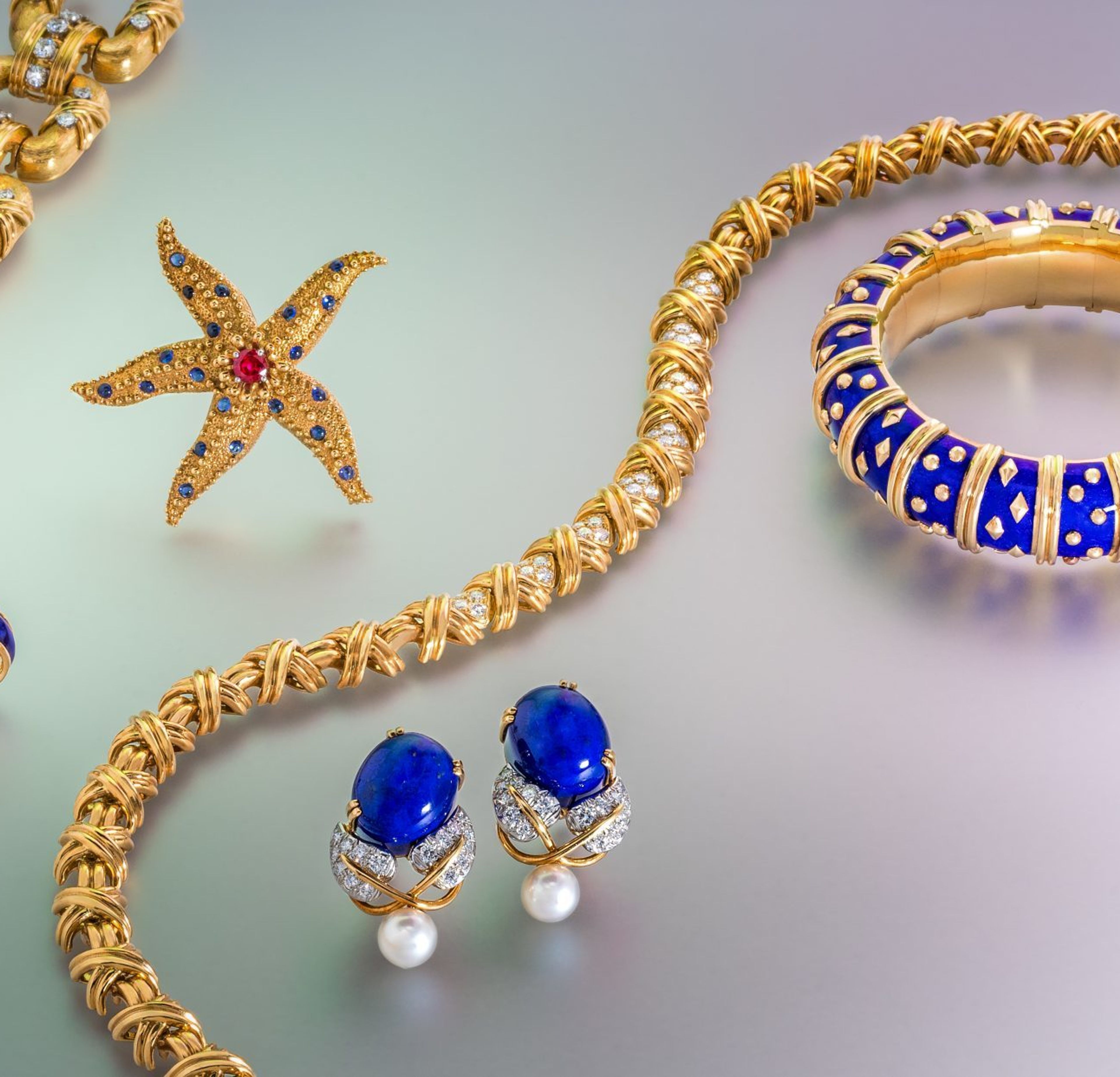
Jean Schlumberger (pronounced ‘Shlum-Bur-Zhay’) is an iconic name in jewelry design. He is one of only four designers ever given permission to sign their work for Tiffany & Co. in the company’s 183-year history – the others being Paloma Picasso, Elsa Peretti, and Frank Gehry. Born in France in 1907, Schlumberger was a completely self-taught artist. His work is known for its creativity, daring use of color, and inspiration from the natural world. Schlumberger designs have a lasting legacy with important pieces continuing to be remade by Tiffany & Co. in limited runs, displayed in permanent collections in museums and worn and enjoyed by collectors around the world. When Schlumberger joined Tiffany & Co. he was given his own independent salon on the mezzanine level of its flagship store on Fifth Avenue – a rare honor. He retained complete creative control of his designs and cultivated an impressive following, including Greta Garbo, Jackie Kennedy, Audrey Hepburn and Elizabeth Taylor. He continued to be a signature designer for the firm for over 30 years. One of Schlumberger’s first designs when he started in 1956 was the iconic ‘Bird on a Rock’ brooch made for the historic Tiffany Diamond (a 128.54 carat yellow diamond). It has been made in several iterations with various large ‘rocks’ of different gem varieties. We are pleased to offer this important brooch (Lot 59) with a beautiful green beryl as the bird’s perch. Lot 59, TIFFANY & CO., SCHLUMBERGER, GREEN BERYL AND DIAMOND ‘BIRD ON A ROCK’ BROOCH Another of Schlumberger’s most famous designs is the ‘Dot Losange’ bangle bracelet, which was first designed in 1960. Jackie Kennedy, then the first Lady of the United States, was a fan and wore her bangle so often they became known as “Jackie Bracelets”, and were popular throughout the 1960s as a chic daytime accessory for ladies including Bunny Mellon and Lauren Bacall. Lot 56, TIFFANY & CO., SCHLUMBERGER, ‘DOT LOSANGE’ BANGLE Schlumberger renewed paillonné enamel for the ‘Dot Losange’ bangles, a technique developed in the 19th century. Extremely labor intensive, it requires the application of translucent tinted enamel over fine pieces of gold leaf (paillons), then is fired at a high temperature and repeated dozens of times to create a thick layer. This fine craftsmanship gives the bangles a unique and beautiful shimmering effect. Marine life was a source of inspiration for Schlumberger throughout his career. He traveled to Sri Lanka, Thailand, Indonesia and the Philippines, where he saw coral reefs and shallow seas, sketching designs of the sea creatures he saw along the way. By the late 1950s, he had his own studio in Guadeloupe, a French colony in the Caribbean, where he was able to connect with nature and the ocean for design inspiration. These pieces are infused with his signature whimsical touch. Lot 53, TIFFANY & CO., SCHLUMBERGER, YELLOW GOLD, RUBY AND SAPPHIRE STARFISH BROOCH Among many design elements he made his own, Schlumberger is famous for ‘X’ motif jewelry representing a kiss. The ‘X’ motif displays Schlumberger’s knack for wearability and timelessness that continue to be worn and admired by collectors today. With warm yellow gold, his designs are a whimsical and elegant addition to any jewelry collection. Lot 57, TIFFANY & CO., SCHLUMBERGER, DIAMOND ‘X’ NECKLACE Schlumberger’s designs continue to delight modern jewelry collectors and are a staple of any collection. Hindman is pleased to offer a collection of nine Schlumberger pieces (lots 52A through 60) in our September 15th auction. Please contact our specialists for a private viewing or more information on how to bid.
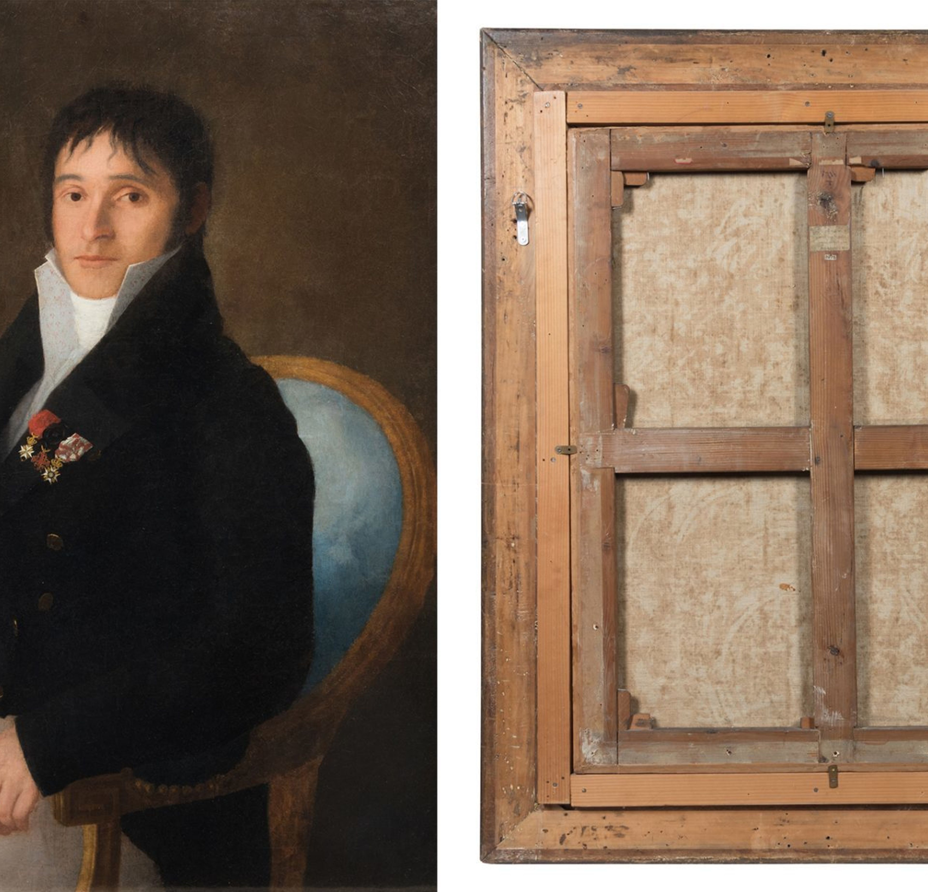
The Hackley Art Gallery (ultimately named the Muskegon Museum of Art) acquired this portrait on June 3, 1913 as a work attributed to Francisco José de Goya y Lucientes (Spanish, 1746-1828). Raymond Wyer, the gallery’s first director, conducted the purchase, which was the most expensive painting ever acquired through the Hackley Picture Fund. The above referenced article in Aesthetics, vol. IV, published by the Hackley Art Gallery, designates the portrait as “one of the most important paintings in our permanent collection.”[i] The sitter, Don Juan José Perez Mora, was an influential civilian and military administrator for the city of Madrid. He is depicted holding a letter in his right hand inscribed in Spanish “Madrid, 10 July 1810. Administration of Madrid. Concerning the most noble Don Juan José Perez Mora.” This same inscription is printed in English on an old paper label affixed to this painting’s stretcher. In 1915, the Art Committee of the United States invited the Hackley Art Gallery to loan six paintings from its permanent collection to hang at the Panama-Pacific Exposition in San Francisco, the most of any museum in the world.[ii] This portrait is specifically referenced by Rossiter Howard, a prominent art educator and one-time director of the Kansas City Art Institute: “Goya’s Don Juan José gives us the feeling of the same period in Spain, though Goya stood alone, rather than as one of a group, in his expression of it […] The character is drawn so that we feel it keenly, the modeling is vigorous and fine, and the composition is sensitive. The painting would stand high among the Goyas of Madrid.”[iii] On February 9, 1929, Juan-Allende Salazar, a Spanish art scholar and trustee of the Prado, called into question the Goya attribution in a letter to the Hackley Art Gallery, and argued that the painting was likely by José Ribelles y Helip (Spanish, 1778-1835) instead. In a letter dated April 15, 1946, Professor Martin S. Soria, an art historian in the Spanish Department at Princeton University, voiced similar concerns regarding the Goya attribution, and reaffirmed Salazar’s identification of José Ribelles y Helip as the true artist. His letter states: “I had felt that José Ribelles y Helip was probably the author of your picture. I have recently been able to check this attribution by comparison with various photographs of authentic portraits by this master in Spain. My conclusion is that Juan José Perez Mora is a work by José Ribelles […] As to the date of the picture, your discussion is very convincing and I fear that for the time being it must remain 1810 or 1818. The decorations are, from the spectator’s left: Order of St. John of Malta, Order of the Holy Sepulchre, Order of St. Ferdinand.”[iv] The Muskegon Museum of Art no longer possesses the two aforementioned letters in their archives. The documentation provided for this lot is courtesy of the Muskegon Museum of Art. Charles H. Hackley (1837-1905) was born in Michigan City, Indiana, and made his fortune in Muskegon’s then thriving lumber industry as the owner of the Hackley-Hume Lumber Mill from 1854-1894. While many lumber mill owners eventually moved their operations to the Pacific Northwest, Hackley remained in Muskegon and emerged as a preeminent philanthropist in the once prosperous former industrial center. Among his numerous endeavors, Hackley envisioned opening a municipal art gallery for the city, and left through a bequest in his will an expendable trust of $150,000 to the Muskegon Public Schools Board of Education, a fund that ultimately came to be known as the Hackley Picture Fund. Hackley stated in his will that the fund was established for the purpose of purchasing “pictures of the best kind,” and in 1910, Muskegon’s Board of Education broke ground on a facility meant to house their growing collection of fine art, ultimately culminating in the opening of the Hackley Art Gallery. In 1979, the Hackley Art Gallery, also known as the Hackley Art Museum, underwent significant renovation and was renamed the Muskegon Museum of Art.[v]

In the early twenty-first century, fashion houses began to prioritize branding more intensely than ever before. This can be seen clearly in popular culture about fashion. Tim Gunn and Heidi Klum’s mission in the early 2000’s to find the next “in” fashion designer on Bravo’s, then later Lifetime’s, “Project Runway” has completely evolved, with their new venture “The Cut” on Amazon openly stating its end goal is to find an up and coming mastermind behind the next mega-brand. While this transition has been treacherous for some established fashion houses, Rei Kawakubo, the designer and founder of Japanese fashion brand Comme des Garçons, has kept branding at the forefront of her mind since her label’s genesis. As quoted in Vogue, Kawakubo stated in 1969 “It is true to say that I ‘design’ the company, not just clothes.” Kawakubo’s focus on branding Comme des Garçons in the mid to late twentieth century was ahead of its time, and by 1973 her label was established officially as a company. In the following decades Kawakubo’s collections garnered criticism from the French fashion elite during Comme des Garçons’ runway shows at Paris Fashion Week. Kawakubo’s ensembles broke all the rules, everything from her color selection, (she favored black), to technique, ensemble’s proudly featured unfinished seams, and even her silhouettes, often models walked the runway draped in asymmetrical fabric, sent shockwaves throughout the fashion industry. However, any press is good press, and the label’s unique style lent itself to the branding demands of the twenty-first century. Figure 1. Lot 136 from sale 740, Spring Fashion and Accessories, held March 19th, 2020 sold above its high estimate, and is one of many Comme des Garçons pieces to appear at auction through Hindman. Instantly recognizable for its nonconformist style, Comme des Garçons expanded far beyond its own company, and collaborated with a plethora of fashion brands across a variety of markets including, Nike, Moncler, Lacoste, Converse All-Star, and even the epitome of traditional French fashion, Louis Vuitton. These collaborations lead to Comme des Garçons integrating into streetwear; the brand’s wildly successful collaboration with Converse All-Star is readily available to the public at retailers like Nordstrom, bringing Kawakubo’s style to the mainstream fashion market. Kawakubo set her sights high for Comme des Garçons and all it could achieve, proving fashion is a vehicle for more than just clothing, but rather presenting an attitude, a singular style, and ultimately a brand. Figure 2. Lot 169 from sale 663, Spring Fashion & Accessories: 1800-2015, sold for an impressive $4,750 to The Costume Institute of the Metropolitan Museum of Art on April 8th, 2019. Comme des Garçons and its various iterations are popular items on the secondary fashion market and have sold successfully at auction through Hindman. As recently as March 19th, 2020, designs from Comme des Garçons have appeared consistently in Hindman sales. Auction 740, Spring Fashion and Accessories featured a Comme des Garçons by Junya Watanabe, Kawakubo’s protégé, lot 136, and sold for $687.50 (Fig. 1). However, the brand has long been of interest among bidders, with lot 169, from sale 663, a Rare Early Comme des Garçons Knit Sweater, circa 1983-84, selling to The Costume Institute of the Metropolitan Museum of Art on April 8th, 2019 for an impressive $4,750 (Fig. 2). Additionally, Comme des Garçons will feature extensively in Hindman’s upcoming Summer Fashion and Accessories and Couture auction, sale 768. Pieces covering the last twenty years of the brand’s collections will be presented to the public for auction as soon as June 19th, 2020 (Fig. 3). Such unconventional ensembles feel perfectly suited to go to the podium for an unprecedented and equally as unique calendar year ahead. Figure 3. Ensembles from a two decades worth of design from Comme des Garçons will be headed to the podium this summer, June 19th, 2020 in sale 768 including lot 90 a Comme Des Garcons Jacket and Skirt F/W from 1996 and lot 96, a Comme des Garcons Soft Sculpt Dress, from 2014.
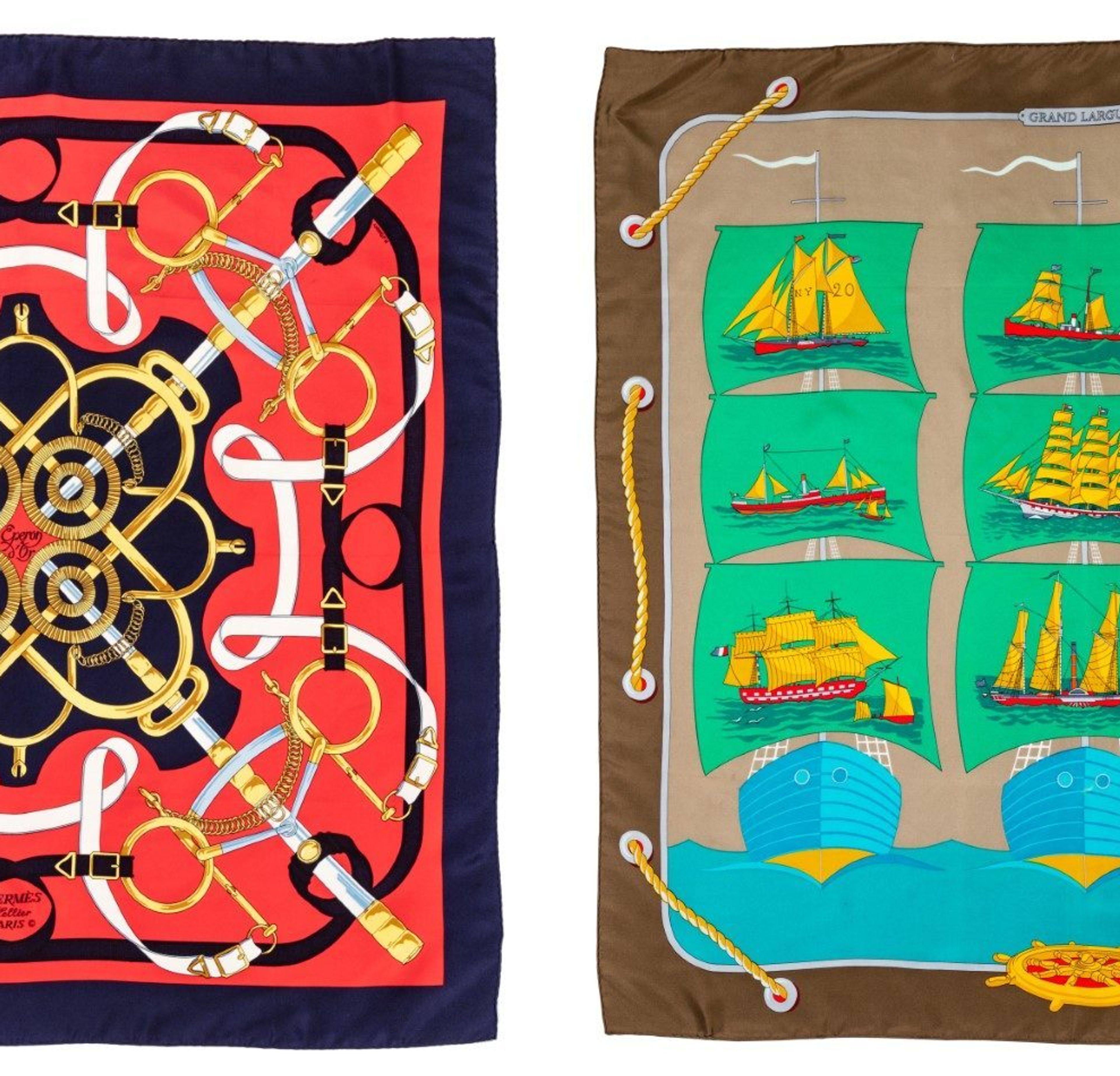
It should come as no surprise to those familiar with Hermès Paris that the logo of the legendary lifestyle brand, stamped and embossed across a plethora of luxury goods, has been a horse drawn Duc carriage since the 1950s. A Duc in the French monarchy was a high ranking nobleman, just below members of the ruling family. When Thierry Hermès began the company with his harness workshop in Paris, France in 1837, he was not focused on serving the needs of King Louis Philippe I, the then King of France, but rather French noblemen. The company has always focused on taking mundane products of their client’s every day, harnesses and saddles, and elevating their design, holding form and function to an equal standard, to make those who are not royal feel royal. Just like the Duc of their logo, Hermès strives to create products for their clients, whether monarchical or not, that infuse their life with the luxury of royalty. Not long into the twentieth century, Hermès was approaching its hundredth year as a firm, and the house’s product line began to expand in the early 1920’s. Thierry Hermès’ grandson, Émile-Maurice was now in charge of the family run company alongside his brother Adolphe. Not only was the company, at the time named Hermès Frères, ascending rapidly in clientele now serving foreign royalty creating saddles for the czars of Russia, the firm was building upon its history of designing luxuriously functional pieces, with leather handbags. Created simply because Émile-Maurice’s wife could not find a leather bag to her liking, the house began what would be a storied history into women’s accessories. Over sixty years later, Émile-Maurice’s own grandson, Jean-Louis Dumas, would create the iconic Birkin bag at the behest of the purse’s namesake, English actress Jane Birkin, who complained she too just couldn’t find a bag to fit her needs. Jean-Louis’ father, Robert Dumas, successor to Émile-Maurice, continued to focus on the firm’s interest in women’s accessories pioneered by his father-in-law in the 1920s, debuting the Hermès scarf in 1937, the year of the company’s 100th anniversary. Created from imported Chinese silk, more durable than other silks on the market at the time, and with Dumas’ penchant for color and composition, the scarf became an instant success. Hermès’ tried and true formula of form and function reigning supreme again. The scarf, with thousands of designs created between its inception and today, has been seen on a plethora of celebrities and royalty. It has adorned the likes of Audrey Hepburn, acted as a sling for Grace Kelly, and to this day is styled as a head scarf by Queen Elizabeth II. As recently as 2020, the Hermès scarf has found renewed fame with American physician and diplomat Dr. Deborah Birx. During the daily White House briefing, Dr. Birx’s ensemble always features a new Hermès scarf, whether wrapped delicately around her shoulders or tied in a classic knot around her neck. America has become enraptured by Dr. Birx’s collection, resulting in both an Instagram account dedicated to posting her daily selection, to even a Saturday Night Live sketch during the show’s 2020 Mother’s Day episode. Prints similar to those found Dr. Birx’s own collection will be featured in Hindman Auctions’ upcoming auction, Summer Fashion and Accessories (Online Only) Sale 768, on June 19th, 2020 at 10:00 am. April 8th, Dr. Birx wore the Rocaille II design complementary to the Coquilles pattern by Robert Delpire from LOT 238 in Sale 768 (Fig. 1). Dr. Birx continued her nature theme by wearing a delicate cherry blossom similar to two scarves soon to make their way to the podium at Hindman, LOTS 220 and 221 also in Sale 768 (Figures 2-3). Due to their respective relationships with fashion icons, and royalty, Hermès scarves and leather handbags are wildly popular among vintage collectors and fashionistas alike. With the exclusivity surrounding Hermès’ handbags, as stories of waitlists ran rampant in the early twenty-first century, and the bags’ reputation for its exquisite hand craftsmanship, buyers often scour the luxury resale market to find the Birkin of their dreams. Pictured, two 40cm Hermès Birkins, lots 271 and 272 from sale 740 Spring Fashion and Accessories, were won for significantly less than they would have cost the bidder had they purchased the items in store, making fashion dreams accessible for devotees to Hermès (Fig. 4). However, significantly less does not mean lesser, as this deal still costs bidders $7,500 and $5,750 respectively. Scarves are similarly a great deal at auction, with the opening bid asking a mere $150 or less, with lots 262 and 266, pictured, selling at the opening bids (Fig. 4). The auction world works to continue Hermès’ vision, whether royalty or not, luxury is not inaccessible, and should be integrated into even our most functional pieces with ease.
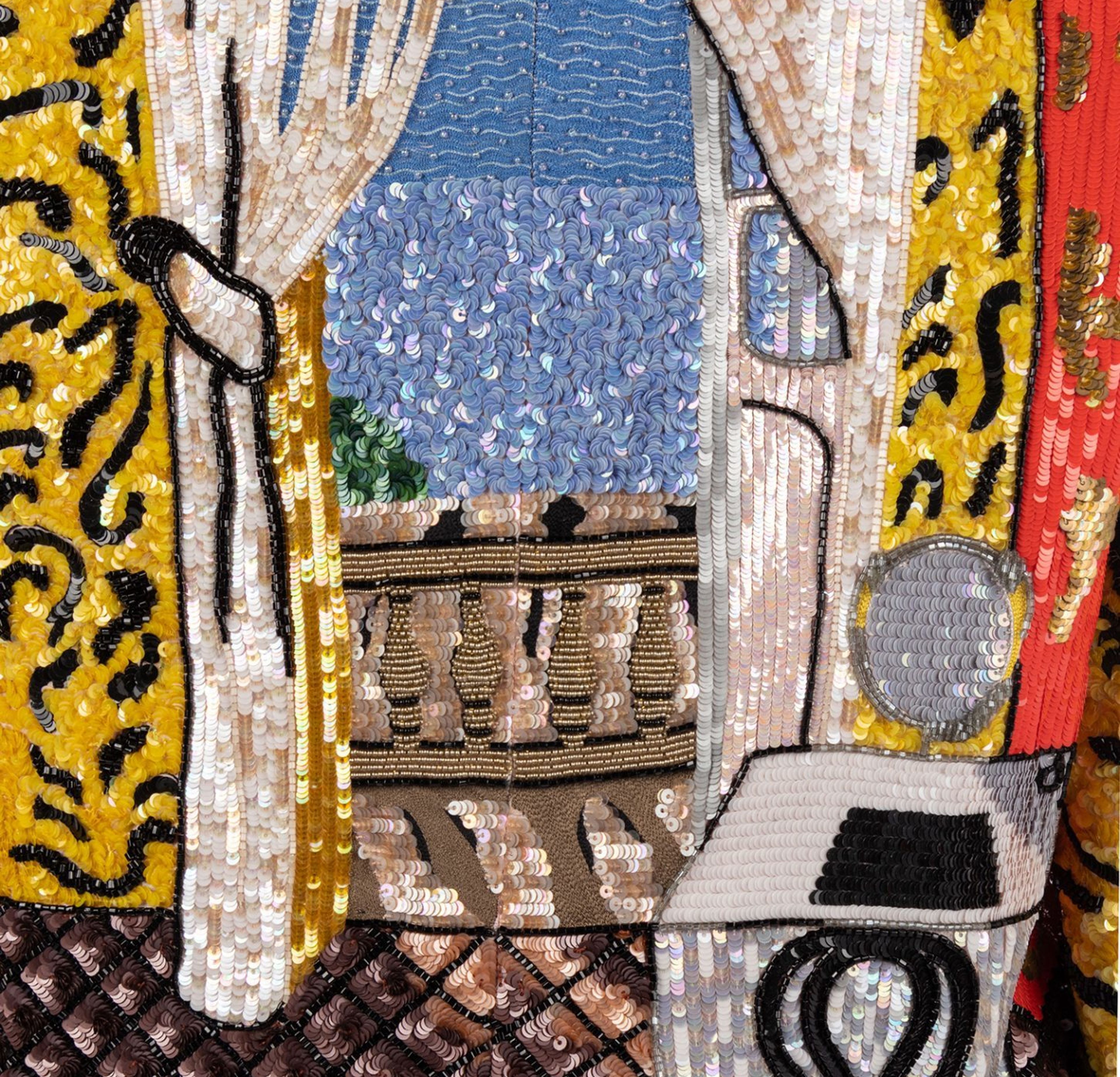
William Ralph Blass, better known as Bill Blass, was an American designer and pioneer in American fashion during the late 20th century. Born in Fort Wayne, Indiana in 1922, Blass’ rise to the top of the fashion industry was rather unorthodox. After leaving Indiana to attend the Parson’s School of Design in New York City at the age of 17, greater global events eventually took precedence in Blass’ life. Blass served over three years in the U.S. Army during World War II, putting his time at Parsons on hold, but his service did not deter his design ambitions. By 1946 Blass was working for Anna Miller and Co. back in New York. When the company merged with Maurice Retner Ltd. in 1959 Blass became the head designer of the new Retner Ltd.. Blass’ designs promoted a sophisticated ease in women’s clothing, not unlike the chic and sporty designs of his European contemporary Coco Chanel. His popularity with America’s elite, including Diana Vreeland of Harper’s Bazaar and eventually American Vogue, aided in the U.S. creating a strong presence in the global post-war fashion scene, rivaling the established French fashion houses. Blass would spend the following decades promoting a modern American lifestyle with his designs, eventually becoming the owner of Retner Ltd. in 1970, and renaming the brand something closer to home, Bill Blass Ltd. Bill Blass the label would solidify his place in the pantheon of great American designers, continuing well past Blass’s own retirement in 1999 and into the twenty-first century. Blass’ material appears often in Couture and Luxury Accessories auctions at Hindman. Designs across multiple decades of the esteemed designer’s career have made their way to the podium, producing some of the most interest from buyers and vintage lovers alike. Most recently, sale 740 Spring Fashion and Accessories featured a rare Bill Blass Matisse-Inspired Jacket and Top from the designer’s Spring/Summer 1988 collection, lot 28 (Fig. 1). As noted by fashion journalist, Amy Fine Collins, in her 1988 article for Art in America “Sequined Simulacra”, while Blass may have taken inspiration directly from the creations of French Post-Impressionist Henri Matisse, but his exposure to such pieces came from a 1987 exhibition held in Washington D.C.’s National Gallery of Art. Blass’ recreation of fine art in the context of fashion only serves to highlight the constant tension between the two institutions, with Collins asserting “Art has no practical value, but can appreciate, while clothing is functional but largely devoid of any real investment potential,”. However, Collins admitted Blass himself disagreed with her assessment as Blass stated his Matisse ensembles were “investment pieces—just as a painting would be,”. Ultimately, it would be Blass whose evaluation of the material would come out on top. Over thirty years after the Matisse ensembles debuted, lot 28 sold for $1,375 in sale 740, only adding to the enduring and ever changing tension between fine art and fashion.
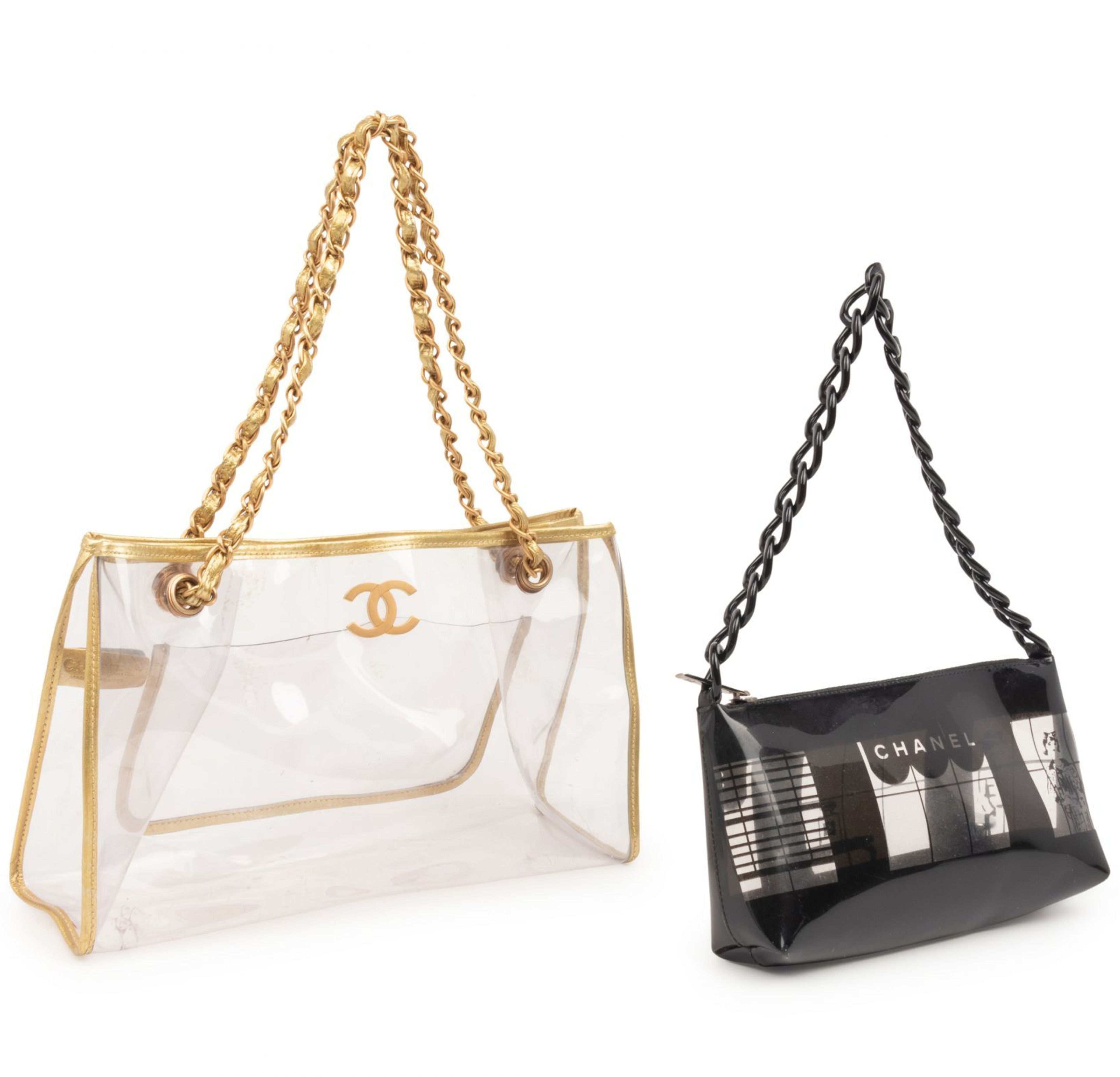
Are the 2000s vintage? It can be hard to believe but 2000 was already twenty years ago. While many recognize clothing that is at least twenty years old to be vintage, in December 2018 the New York Times argued the vintage cycle for the early 2000s is even shorter. The 2000s aesthetic has made an unprecedented early come back in contemporary fashion and auction can be a great place to find some original 2000s pieces for your wardrobe. Whether you consider them vintage or not is up to you, we won’t judge! Here are some of our favorite 2000s pieces that have sold at auction this past year. Two Chanel Vinyl Bags Two Chanel Vinyl Bags, 2000s, Sale 740, Lot 217, Sold for $1,187.50 Chanel has an enduring legacy as the “it girl” brand of choice and the early 2000s were no different. Karl Lagerfeld celebrated Chanel’s most famous bag, Coco Chanel’s 1955 release the Flap Bag 2.55, with a re-issue in 2005 aptly titled the Reissue 2.55. A 50th anniversary celebration, the Flap Bag’s rebranding was so wildly successful the quilted purse was seen on actresses and socialites alike in the early 2000s. Today Chanel still holds its title as the “it girl” bag of choice. As vinyl and Lucite bags have become increasingly popular over the past few years, seen recently on veritable “it girl” Ariana Grande, lot 217 in sale 740 from Hindman’s Couture and Luxury Accessories department was decidedly ahead of its time. One lucky bidder was able to have their “it girl” moment for an impressive $1,187.50. Yves Saint Laurent Earrings Yves Saint Laurent Earrings, 1990-2000s, Sale 703, Lot 250. Sold for $531.25 Before it was just Saint Laurent there was an Yves to account for. In the 2000s, Yves Saint Laurent was no stranger to integrating logos and branding within their designs. While the brand did not engage in dripping their branding across any and all of their designs like many of their contemporaries, it is not coincidence their most popular purse, the YSL tassel bag, places the brand’s logo front and center. Even after the company’s rebranding, the “Y” in YSL still remains integral to any accessory monogramming. While the 2000s label love endures in the brand’s handbag designs, an unexpected accessory has made a return from the brands vault: rhinestone wording on accessories. Seen now mostly on barrettes, rhinestone wording has made a huge comeback thanks to 2000s nostalgia. The trend is so popular one dedicated fashionista won lot 250 from sale 740 for $531.25. Now that’s what we call commitment to an aesthetic. Chanel Giraffe Textured Purse Chanel Giraffe Textured Purse, 2000-02, Sale 740, Lot 222. Sold for $937.50 Animal print, whether you love it or hate it, it is definitely here to stay. The 2000s aesthetic was not just preoccupied with loud logos, but any and all design details that could make one’s ensemble stand out. Animal prints were key to being as eye catching as possible, for better or worse. As Chanel was an established favorite among our 2000s logo loving glitterati, the Chanel Giraffe textured purse fit perfectly into one’s wardrobe. Small accessories were popular during this time as well, a commentary on how everything in our world seemed to be shrinking, especially cell phones. Nothing felt more futuristic than a teeny tiny accessory. The petite size of this purse adheres to this 2000s preference and has reemerged as a recurring 2000s trend on red carpets. For examples, see Lizzo’s microscopic purse at the 2019 American Music Awards. One bidder will be able to live out their futuristic fantasy as lot 222 in sale 740 sold for a steal at $937.50
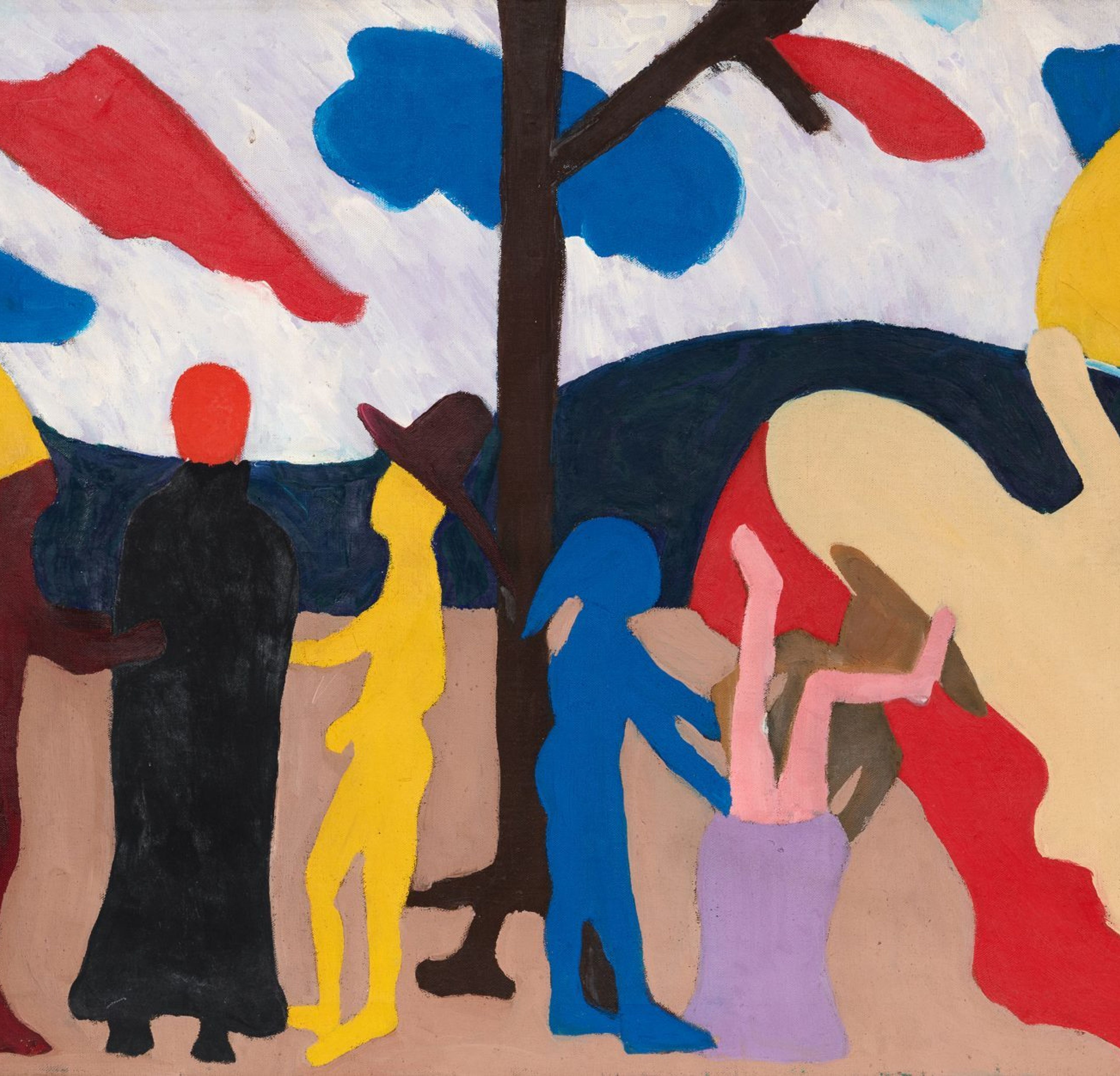
Bob Thompson’s The Sack (The Snook), 1961, is a drama of bold exaggerations, highlighted by the artist’s use of assertive, and unmodulated colors. Hindman is proud to offer this work as lot 49 in our May 21st, Post War and Contemporary Art Auction. Thompson’s short, dynamic, career began in the late 1950s and ended in his premature death less than a decade later. Born in Louisville, Kentucky, Thompson studied briefly at Boston University and at the University of Louisville. On the advice of a teacher, in the summer of 1958 he traveled to Provincetown, where he was introduced to the expressive figurative work of Jan Muller, Hans Hofmann and Red Grooms. Later in 1958, Thompson migrated to New York, where he quickly arrived at his iconic style. Using as a springboard the dynamism of classical scenes by artists such as Piero della Francesca, Nicolas Poussin, and Tintoretto, Thompson transformed their compositions into simplified, abstracted forms applied with flat, bright color fields. The Sack (The Snook) highlights the singular aspects of Thompson’s mature style. Executed in Paris, where Thompson and his wife had settled in 1961 thanks to a Walter Guttman Foundation grant, the collage-like painting depicts an enigmatic scene, with its silhouetted figures and vivid colors. Although the exact inspiration for this artwork is unknown, Thompson frequently drew on Greco-Roman mythology and the Bible, as well as appropriating material from Classical paintings. He turned this subject matter into his own vision of contemporary allegorical nightmares. In The Sack (The Snook), two mysterious figures in hats enrobe a third in a black sack. To their right, two other figures appear to have thrust a person head-first into a purple sack. Additional ambiguous figures populate the mid-ground. The scene takes place against a shallow, compressed space that calls attention to the picture plane. The flattened forms and silhouettes evoke the undulating rhythms and syncopated movement found in jazz music, which Thompson deeply admired. Together, these elements combine to create an abstracted, dreamlike atmosphere that renders place and time indistinct.