New & Noteworthy
Stay up to date with news, highlights, & features from across Freeman's.
Stay up to date with news, highlights, & features from across Freeman's.
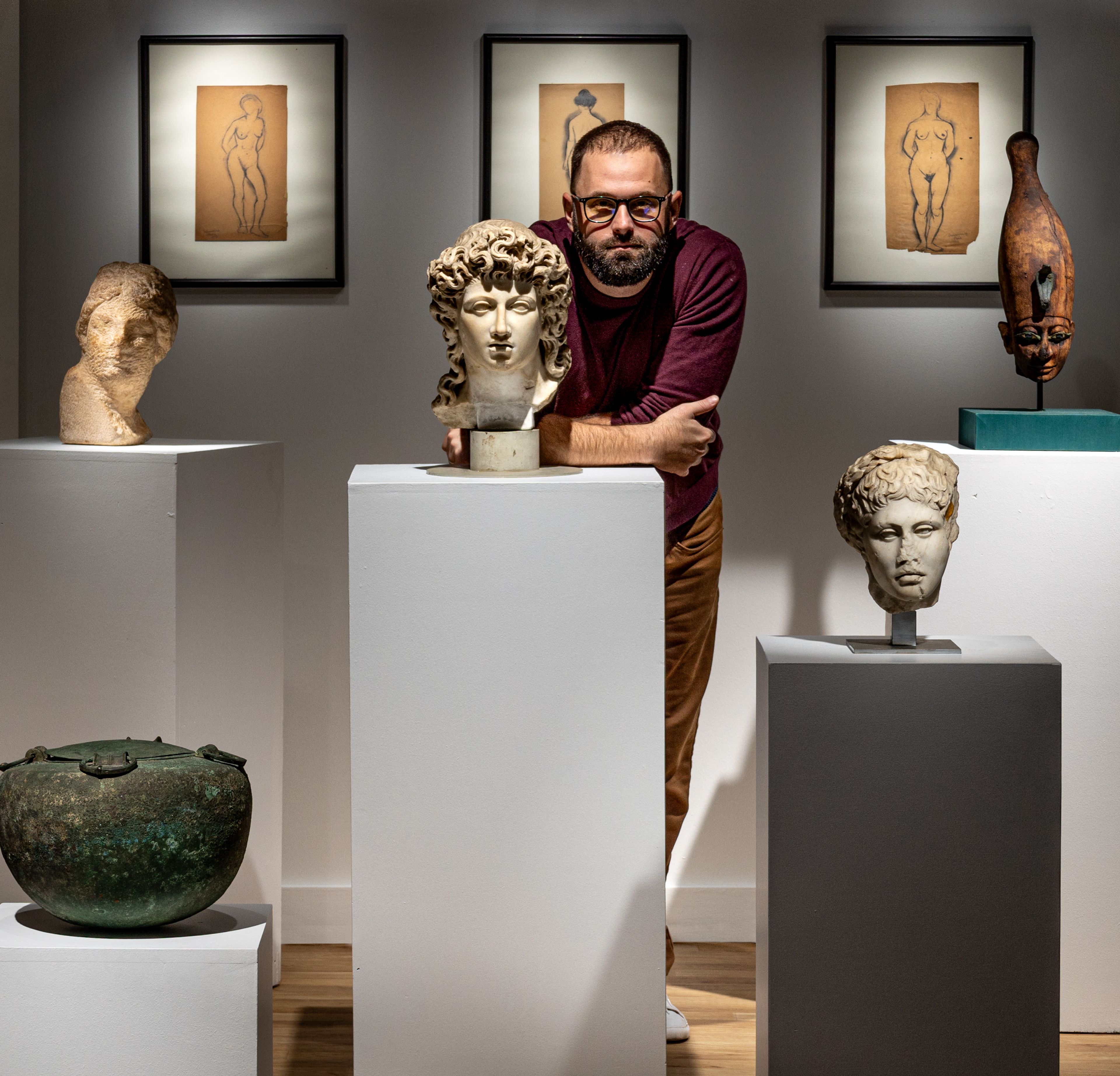
Jacob Coley has focused his career on promoting and preserving ancient art. As the Vice President and Head of Antiquities and Ancient Art at Freeman's | Hindman, Jacob brings a wealth of knowledge and a deep passion for humanity's earliest creative achievements. With an exceptional eye for detail and an unwavering commitment to scholarship, he has become a trusted advisor for collectors and enthusiasts alike. Join us as we highlight his successes, including some of his favorite treasures sold to date. From left to right: An Egyptian Gilt Cartonnage Mummy Mask | Sold for $175,000 A Roman Marble Portrait Head of Antisthenes | Sold for $100,000 A Life Dedicated to Antiquities Jacob's fascination with ancient civilizations began early in life, leading him to pursue academic studies in art history at The University of Miami. Throughout his career, between world-renowned institutions and private collections, he has developed a reputation for a meticulous approach to provenance and ability to uncover each object's story. Before joining Freeman's | Hindman in 2021, he worked as Managing Director of Ancient Art at Colnaghi, the world's oldest commercial art gallery. His position within the Greek and Roman Art department at the Metropolitan Museum of Art formed much of the scholarly foundation that continues to support his commercial approach today. “When we decided to build a stand-alone Antiquities Department in Chicago, we knew our success would depend upon placing the right person at the helm,” Molly Morse Limmer, Deputy Chairman, tells us. "Jacob encompasses so many of our firm's core values. His passion for the field continues to exude as he drives our commitment to selling ancient art into the future.” A Roman Marble Head of a Youth Wearing a Laurel Wreath | Sold for $504,000 A Byzantine Gold, Sapphire, Chalcedony, Amethyst, and Emerald Necklace | Sold for $25,200 A Champion for Antiquities Establishing the department as a market leader, Jacob remains committed to ensuring these treasures are appreciated and understood. His leadership in this field reflects a dedication to these ancient objects and the cultures they represent. Speaking to the allure of the collecting category, Jacob shares, "Antiquities are a window into ancient daily life and artistic expression. Each piece carries a story that has endured for centuries, and it is my greatest passion to help those stories find their next steward." Jacob's expertise spans a wide range of ancient art, including art from the Mediterranean, Egypt, and the Near East. He routinely handles works in bronze, marble, pottery, gold, silver, and glass from the Neolithic Period to around 1000 AD. Major auctions occur twice yearly, featuring Attic and South Italian pottery, Egyptian reliefs, Greek and Roman marble statuary, mosaics, Jewelry, and more. His department also focuses on ethnographic art from Africa, Oceania, and the Americas, focusing on Central and South American cultural material. A Roman Marble Crouching Venus | Sold for $165,100 Join the Journey This spring, Jacob and the department will present two stellar auctions, including Jewelry Through the Ages: Ancient to Neoclassical on March 25 and Antiquities and Ancient Art on May 22. These sales promise to showcase the rich diversity and historical significance of ancient artifacts. We are currently accepting consignments for the year and invite you to consign via our request an estimate form. To learn more about Jacob and the Antiquities and Ancient Art department, click here.
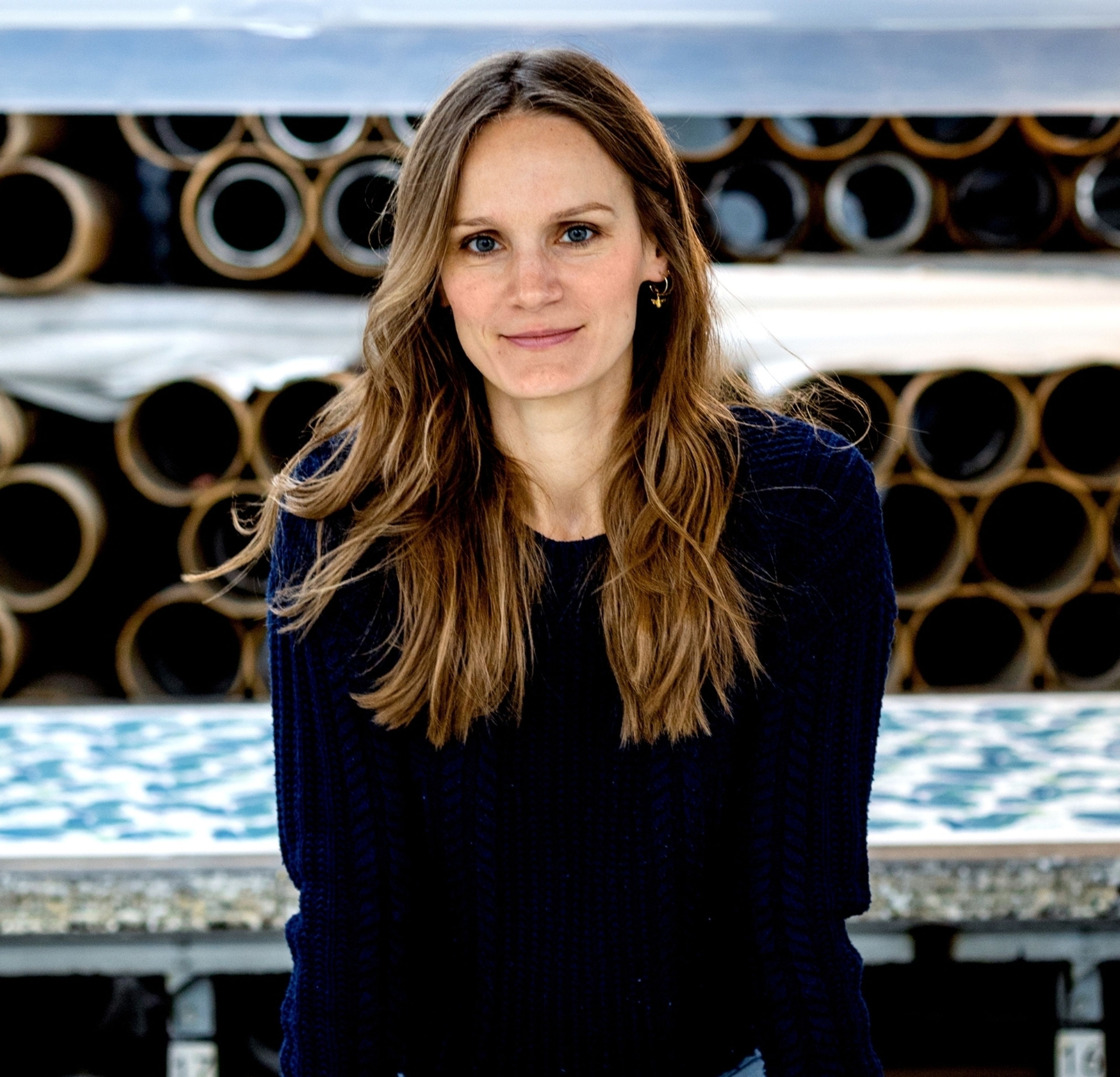
Ahead of Palm Beach Design Days, hosted by Freeman’s I Hindman on January 30, we invite you to our West Palm Beach gallery and saleroom, which is located adjacent to the Norton Museum of Art. Elizabeth Marshman, Associate Vice President in the region, speaks with renowned British fabric and wallpaper designer Fanny Shorter. Her lively designs are showcased in our offices as part of this week-long celebration of all things decorative, design, and architecture-related. E: Fanny, thank you for working with us! Your fabrics and wallpapers, with their gorgeous and vibrant colorways, seem ideally suited to the climate in Palm Beach despite being created in England (!). Can you tell us about the inspirations for your designs? F: I was very excited to be asked, so thank you! Yes, in fact, sometimes I wonder if we’re a bit too vibrant for our somewhat muted weather in the UK. But thankfully, we’ve begun to embrace color and pattern here in a much more enthusiastic way, so it all worked out. I studied illustration, and working with a narrative has always been my greatest inspiration. Recreating the feeling or atmosphere visually that a piece of text evokes for me mentally is something I come back to regularly, and my work is often initially inspired by a strong narrative. I love a fauvist color palette, traditional printing, storytelling, book illustrations from the turn of the century, and field guides. My husband collects antiques, mainly 18th-century porcelain and silver, and while I try to encourage dealing rather than collecting, his reluctance means our house is full of his beautiful things. Birds and Beasts Ionian Blue Wallpaper E: Palm Beach Design Days is a hub for everyone, from enthusiasts to professionals, to engage with the latest trends and industry issues. Share how you began your journey in this field and what advice you would offer to aspiring young designers. F: It happened gradually and somewhat unintentionally. I worked as an illustrator for nearly 10 years before launching my own line. I learned to screen print in college, and it truly inspired me. I started experimenting with printing my own designs, beginning with paper and then moving to textiles. I began selling cushions and prints that I had designed and made, and I loved working on my own concepts and ideas. I printed my first fabric by the yard in 2015, and it has grown from there. My advice to young designers is to take risks, discover what makes your designs unique, hold onto that, and be ready for it to take time. The industry is a bit of a slow burn, and you must invest a lot into a design long before you find out if it’s worth it! Birds and Beasts Sand Wallpaper E: How do you balance your creativity and artistic impulses with the commercial aspects of designing? Were there any designs that surprised you when you released them? F: Even though I now work according to my own briefs, I still have to be somewhat guided by what designers actually want to use. However, I’m always pleasantly surprised by what proves popular, and usually, thankfully, it’s the designs I've enjoyed creating the most. Margo is our best-selling print, and before I committed to the final design, we considered both its current large repeat and a much smaller scale. I thought the smaller version would be more usable, but I’m so glad we went with the larger scale; it’s being used in a very different way and has become our signature print. Fig Cypress Fabric E: One of the aspects we appreciate about your work is the hand-printing and the remarkable life it imparts to the finished product. How did you scale up production for projects and commissions on such a monumental level? F: Hand screen printing is what initially drew me into this industry. I love the variation and depth you get from screen-printed fabric. The colors are so deep and vibrant, and when you hold it, you can truly feel how it was produced; that connection is quite important to me. While I used to hand print every piece, that method doesn’t scale easily. Now, our fabrics are printed using a gali, which is a hand-operated carriage that holds the screen and moves it along the length of the fabric to print. It’s no longer purely hand printed, but it still retains the depth of print and many of the nuances. E: Who do you admire the most in the world of decoration and design? If you could collaborate with any US designer on a project, who would that be? F: I have long admired Ben Pentreath. When I worked in London, his office and shop were around the corner from me. His designs are playful and progressive but retain all the love and influence of the past. In the US, I have followed Meta Coleman for a long time and love her designs. We have many American clients, and they use our fabrics in a way that is so different from the UK, which I love, often completely fearlessly.
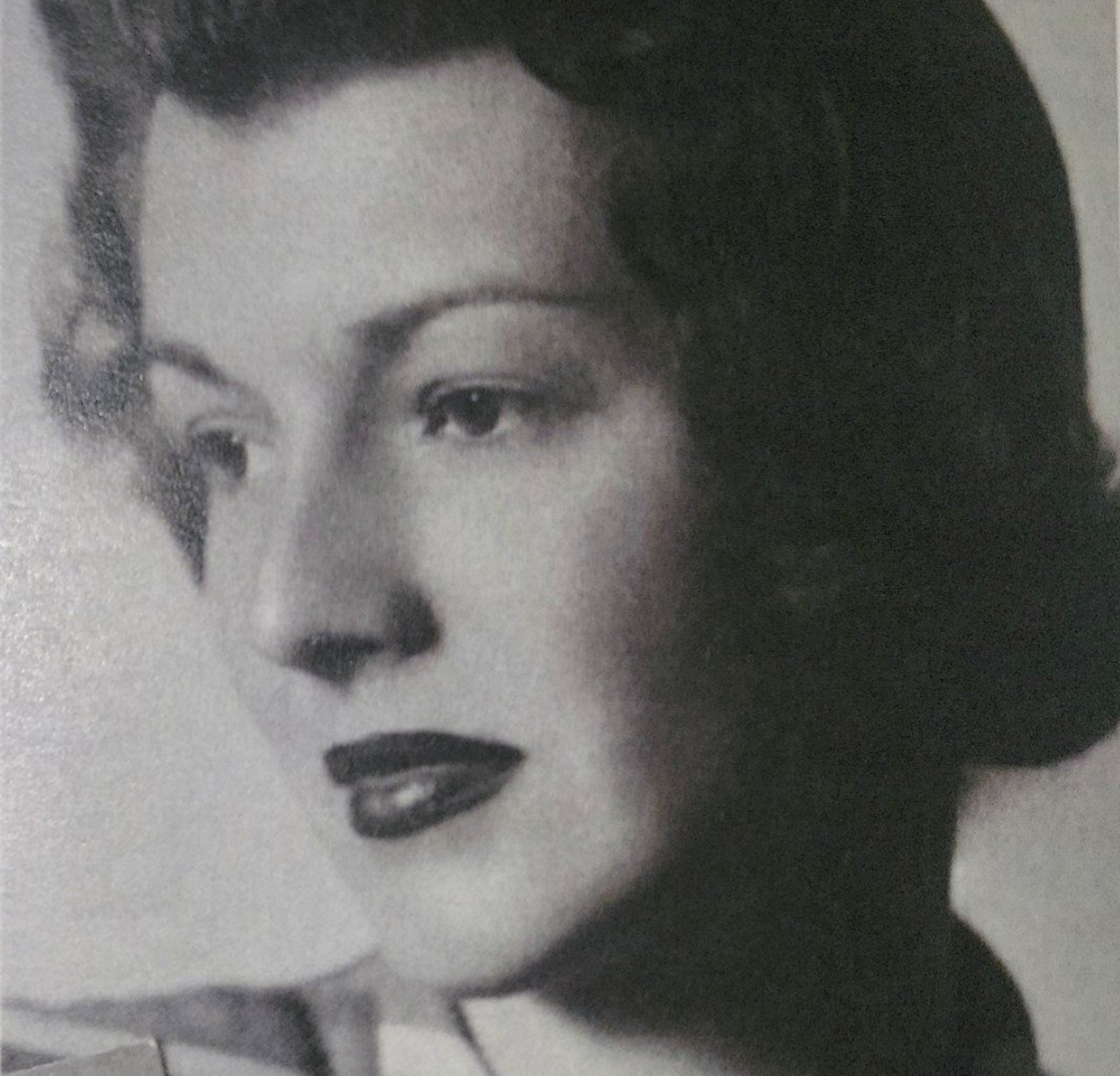
Freeman's | Hindman is pleased to present our live Important Jewelry sale this December 12 in New York, featuring the Estate of Armene Lamson Milliken. Although born in Seattle, Armene Lamson Milliken, was a fixture of New York society. She had an eye for interior design and loved to entertain whether with her friends at the Colony Club, in her home with family, or at one of the many gala events she was involved with supporting: Memorial Sloane Kettering, The Boys Club of New York, The Central Park Conservancy and more. In 1955, she graced the cover of LIFE magazine as Mrs. Averell Clark, Jr. bringing new elegance to the U.S. social scene. Her second husband, Mr. Averell Clark, Jr. was a Flying Ace in WW II and later President of Condor Mining Co. She is also fondly remembered for her joie de vivre, love of ice cream, and her freshly squeezed grapefruit juice with a bit of rum - perhaps the secret to long life. Her sense of style shines through with the jewelry she wore.
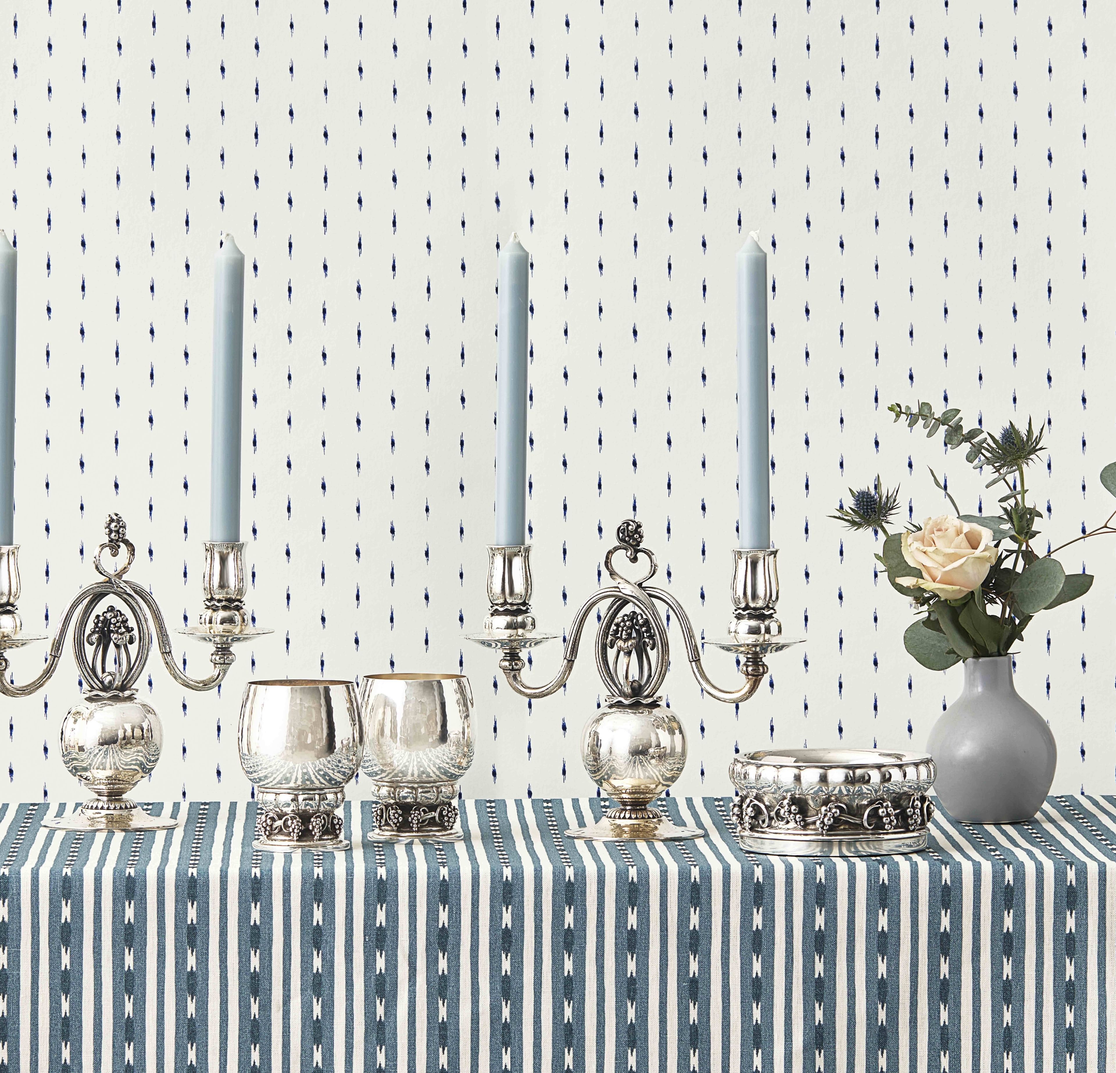
For over a century, collectors, connoisseurs, and institutions have all recognized the brilliance produced by Georg Jensen and the designers at his Denmark firm. Despite the varied backgrounds, eras, and experiences that each craftsman brought to the silversmithing craft, Georg Jensen's silversmithy created a cohesive style that would define a Danish aesthetic and influence design globally in the 20th century. This prolific firm affords the trained eye myriad opportunities to collect objects of beauty, function, and sophistication; many of these important and beautiful objects are available in the upcoming Design for Living: A Private Collection of Georg Jensen Silver. Works within the collection range from those on an intimate scale to masterworks of institutional quality, covering over a century of design tradition in scope. Designed in 1912 and originally untitled and merely referenced by “pattern 19”, the silver centerpiece bowl (lot 12) would become the eponymous Louvre Bowl when the Museé des Arts Decoratifs at the Louvre in Paris acquired the work in 1914. Not even in his second decade of silversmithing, Jensen’s larger-scale works would continue to earn acclaim and be sought after by collectors worldwide for the remainder of the 20th century and well into the 21st. Georg Jensen first found commercial success in the early 20th century by producing silver jewelry. Some of the earliest works to achieve commercial and critical success were his small-scale works such as bracelets, brooches, and other wearable objects. Steeped in the Danish aesthetic of skønvirke or “Beautiful Work,” these small objects present a resounding overture to the following century of the firm’s work. Inset with gems, glass, and cabochons, the commercial success of these items would allow Jensen’s firm to explore larger-scale silver objects. Lot 17, with a Danish assay mark dating the object to 1920 and standing as one of the earliest examples in the sale, shows the firm’s gradual departure from wearable objects to full-scale hollowware. A simple object in form, the table casket carries the tradition of Jensen’s jewelry works with a carved hardstone finial surmounting the box. The rounded body is further raised on feet in the form of a flower blossom. The hammered surface, an aesthetic that runs through nearly all of Georg Jensen’s personally designed works, is a distinct nod to the importance of the craftsman’s “hand” in creating works of beauty [1]. To a connoisseur, owning these early, transitional items can provide critical bridges to the remainder of their collection of large-scale Jensen objects as we see throughout the sale. Lot 23 | A Pair of Georg Jensen Designed Silver Five-Light Candelabra | Estimate: $30,000 - 50,000 Lot 23, a pair of five light candelabra, widely considered to be Georg Jensen’s last design before his death in 1935 shows that Jensen’s commercial success in the 20th century and changing aesthetics of the 1920s and 30s did not fundamentally change Jensen’s vision of the ability of silver to have a “character of its own”. These candelabra express the hand of the craftsman and maintain a design that is distinctly and recognizably Jensen. The central stem forms blossom motifs, each with two arms sprouting from the blossom. The organic structure refused to be relegated by the Art Deco sensibilities of the era. The hammered surface continues to represent Jensen's hand. The “Calm and monumental clarity” [2] expressed through these candelabra create an unmistakably “Jensen” form that collectors will be able to recognize from across a room, let alone from across a dining table. One of the most rewarding aspects of collecting Jensen silver is tied to being able to collect forms from the famous designers who worked alongside Jensen: Johan Rohde, Harald Nielsen, Sigvard Bernadotte and Hennig Koppel. Their varied backgrounds and aesthetics allow for a discerning collector to supplement Jensen’s craft and designs with beautiful objects that uplift the Jensen aesthetic in exciting and novel ways. Originally trained as a painter, Johan Rohde was 10 years Jensen’s senior. Trained as a painter and familiar with Jensen’s work as a sculptor with Bing & Grondahl in the late 19th century. Rohde first approached Jensen in 1906 as a customer, asking Jensen to craft a coffeepot, creamer, and sugar that he designed [3]. Jensen, more concerned about maintaining the highest standards of silver craftsmanship than his own ego, did not shy away from surrounding himself with skilled designers. Lot 29 within the sale shows the varied forms that Jensen’s team of designers could bring while still holding true to the larger thematic qualities that a collector would desire in the firm’s oeuvre. Still maintaining the critical hammered finish, the centerpiece bowl stands atop an almost cosmic sphere. Departing from Jensen’s organic structures, Rohde still reflects the core tenets of the firm. Works like this allow a connoisseur the ability to collect objects that create a rhyming poetry of various forms while still maintaining a composed aesthetic that unite the entire collection. By employing and empowering a talented cadre of designers, Georg Jensen produced works both great and small while maintaining a core set of beliefs imbued with discerning taste. For seasoned and beginner collectors alike, this superlative collection is an opportunity to acquire works that speak to one’s own taste and, at the same time, remain indelibly Jensen. Works Cited: Thulstrup, Thomas C., Georg Jensen: Silver and Design. Gads Forlag. Copenhagen, Denmark. Pp. 27. Georg Jensen & Wendel, Georg Jensen Silver. Georg Jensen & Wendel. Copenhagen, Denmark. 1935. 7. Thulstrup, Thomas C., id. Pp, 54.

Freeman's | Hindman is honored to present Design for Living: A Private Collection of Georg Jensen Silver this December 11 in New York. Join Nick Coombs, Senior Specialist of European Furniture & Decorative Arts, as he speaks to Helene Blanche, Designer and Founder of Helene Blanche Fabrics & Wallpaper. Thank you to Helene for the featured fabrics and wallpaper displayed throughout this Q&A. Nick Coombs, Senior Specialist, European Furniture & Decorative Arts: Helene, tell us a little about your background and training and what inspired you to become a designer. Helene Blanche, Designer and Founder of Helene Blanche, Fabrics & Wallpaper: I trained in textile design at Central Saint Martins College of Art and Design in London, but I’ve always been inspired by art and artists and have a sense of working in a broader artistic tradition. Artists such as the Danish painter Wilhelm Lundstrøm and French artist Fernand Léger were key sources of inspiration for my fabric designs involving a series of small repetitive patterns, maintaining the same focus on contrast in colors and shapes as they did. The sculpture and art installations I saw while taking art and sculpture classes before I began my degree filled me with fascination and joy. This introduction to art gave me time to reflect and to be curious. I can relate to the artist’s work and methods when I hand-paint and design a new pattern using the tools I learned back then. NC: The extraordinary silver designs in this collection are about this timeless synergy between form and function. What practical considerations must you make when sourcing and deciding on the raw materials to ensure your designs function well with their end-use in mind? HB: Quality is everything when considering the materials in my work. I source silk from Italy, linens, and cotton woven in Belgium, and I use English artisans to make our wallpapers. Sourcing the best starting point for the fabrics and wallpapers impacts the final finish and presentation. For the designs, I start with pencil, ink, or charcoal on paper to get the balance of the composition. I am attracted to and instinctively fascinated by the simple: the beauty in a line, a brush stroke, or a drop of ink. My job is to compose these elements through repetition so that a pattern emerges. Then come the colors. My working process is about allowing the prints and patterns to unfold in a vibrant and artistic process. NC: Growing up near the lakes and forests just outside Copenhagen was an enduring source of inspiration for Jensen, and many of his works include organic themes. What are the primary influences or inspirations you draw from in your work? HB: I like to draw inspiration from various artistic movements and cultures. I’m equally at home with Japanese minimalism and avant-garde artists as I am with European Neoclassicism, Cubist art, and historic Parisian textiles! I think the pared-down simplicity of some of the later Jensen designs and the organic forms are ideas and inspirations I share – that studied simplicity is also very much part of a Scandinavian design aesthetic that is a tradition my work becomes a part of. NC: Our marketing photography used the Eivor stripe and drop pattern fabrics. Could you tell us more about the origins of these particular designs? HB: The Drop Collection explored how a single drop of ink behaves when it meets a surface. It’s a very simple idea, but sometimes, the most beautiful things in life are exquisitely simple. The Eivor stripe is one of our newest designs and combines the visual interest or complexity of the interlinked elements, including different stripe widths. The way the darker and lighter elements interplay again comes from the idea of how inks behave and do, in a small way, reference the beauty of ikat. NC: Finally, if you could choose 2 or 3 works from the collection for your own home, what would they be, and why are you drawn to them? HB: I love lots 20 and 21, including these ethereal inset moonstone mounts. The beautiful blue tones against the silver and the natural shell ornaments recall Renaissance ideas about Venus, love, and rebirth. They also have an incredibly modern feel. The Harald Nielsen designed thirteen-light candelabra (lot 42), which is much grander and makes an incredible statement. I could picture these on pedestals in mirrored alcoves in a contemporary dining room setting. They would look exquisite against the spot wallpapers in my collection with their iridescent surface detail! Last but not least, lot 47 – the Harald Nielson cocktail shaker for the holiday season is wonderful – the fine hammered details and floral-cut openings for the sieve in the top are so elegant for entertaining. They would provide a wonderful talking point for guests.
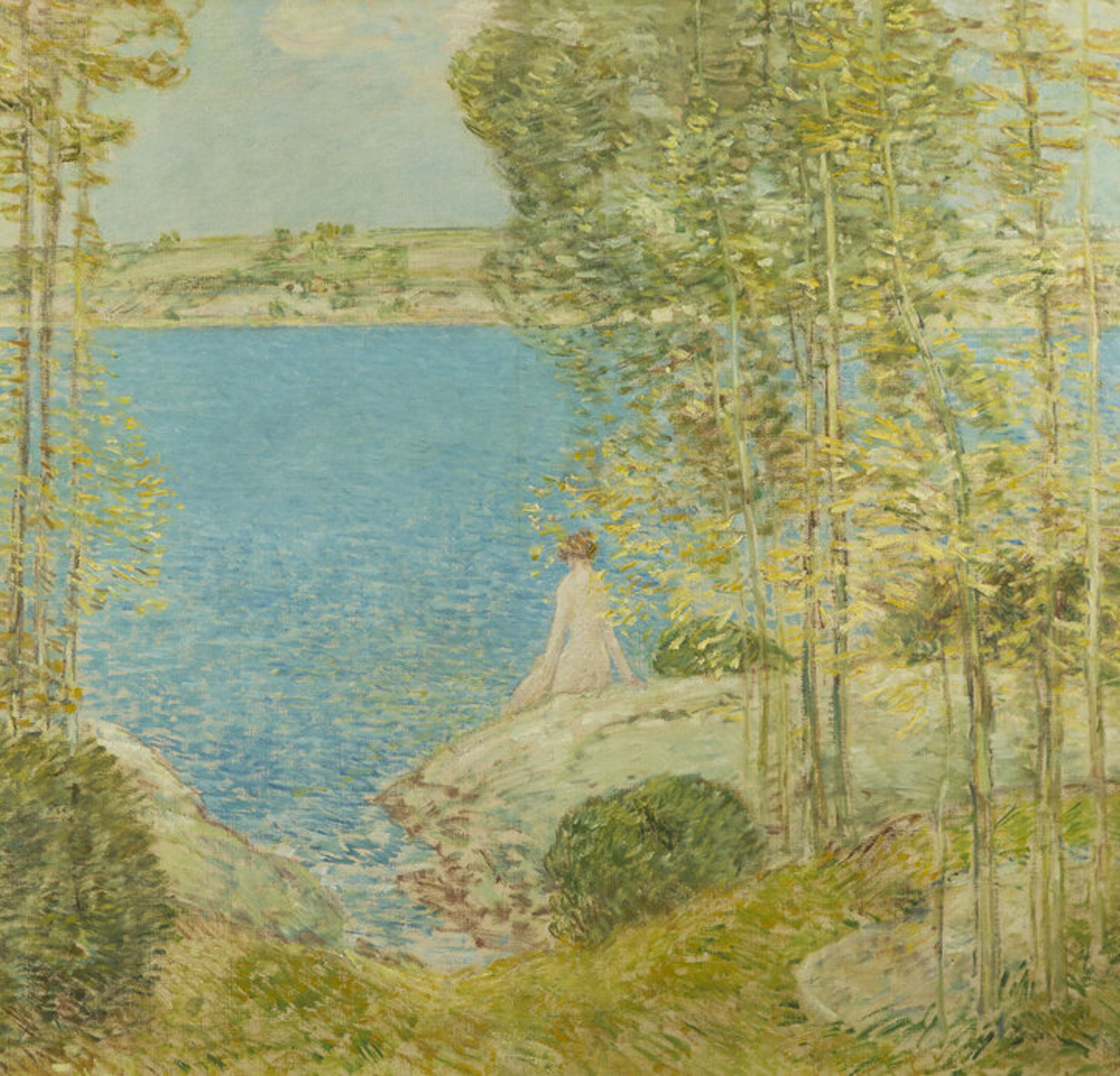
In the first two decades of the twentieth century Impressionist practice in America was one of optimism and buoyancy, often showing sitters at leisure in peaceful settings. To create a distinctly American strand of Impressionism, emphasis was placed on the locale, reinforcing an emotional attachment to recognizable regional landscapes, comfortable spaces, and familiar interiors. Edward Henry Potthast's A Happy Group and Frederick Childe Hassam's The Bather both evoke bright, blissful visions of leisure and display a fast, dashing manner, revealing an unquestionable command of impressionist techniques. From 1910 onwards, New York beach scenes became Potthast's preferred subject matter. In A Happy Group, a rich, bright palette and fluid brushstrokes capture sunlight and movement. Rather than offering social commentary, the painting exudes pure bliss and escapist pleasure. The palette in Hassam's The Bather is equally vivid, but the brushstroke is choppier, creating a wiry visual pattern that contrasts with the quiet subject of the painting: a nude woman basking on a sunlit coastline, Hassam's reimagining of the graceful nude, a common classical trope, in the brisk and bright vocabulary of Impressionism suggests that his intention is less documentary than allegorical, transposing an idealized notion of beauty onto a quaint and familiar New England landscape. The Music Lesson (1921) by Thomas Wilmer Dewing is also replete with a sense of peace and quiet, though conveyed through diffused, subdued tones, rather than bold hues. The setting is an undefined and bare room, save for the piano. The woman sits alone far in the background, detached, seemingly unapproachable. Dewing's manner, combining precise draftsmanship with fuzzy contours, gives the painting a gauzy look and a disorienting intimation that meaning is elusive. This interpretive deadlock precludes defining the woman in conventional terms. She is clad in a neoclassical dress, reminiscent of archetypal allegories of beauty, but that narrative becomes obsolete as soon as it is formed. The modernity emanating from Dewing's method-the fraying contours, evanescent light, the off-center arrangement of the composition- instantly disrupts the outmoded vernacular of ideal beauty and of the female body as its focus. Women have widely been portrayed in fixed traditional gender roles. Yet, this group of portraits, featuring women engaged in leisurely or intellectual activities, quietly and poetically challenges the usual relationship between the viewer and the female sitter. We are prompted to visually connect with her, perfectly still in her place, only to be confounded by her elusiveness; engrossed in a different mental space, she escapes any attempt at defining herself fully and permanently. Dewing's portrait makes that escape explicit through her frank, direct gaze, daring the viewer to enter the uncluttered room she occupies, without any promise that any narrative will unfold and meaning will be elicited. Freeman's | Hindman is delighted to feature these compelling works in our upcoming December 8 auction of American Art, alongside canvases by noted Impressionists Richard Miller, John White Alexander, and Irving Wiles. This exceptional group brings forth the vibrancy of American painterly practice at the turn of the twentieth century and showcases the myriad ways in which impressionists masterfully captured blissful moments of leisure. Lot 36 | Childe Hassam (American, 1859-1935) The Bather (The Bather I), 1904 | Estimate: $150,000 - 250,000 Lot 31 | Edward Henry Potthast (American, 1857-1927) A Happy Group (On the Sea Shore) | Estimate: $50,000 - 80,000 Lot 21 | Thomas Wilmer Dewing (American, 1851-1938)The Music Lesson, 1921 | Estimate: $200,000 - 300,000
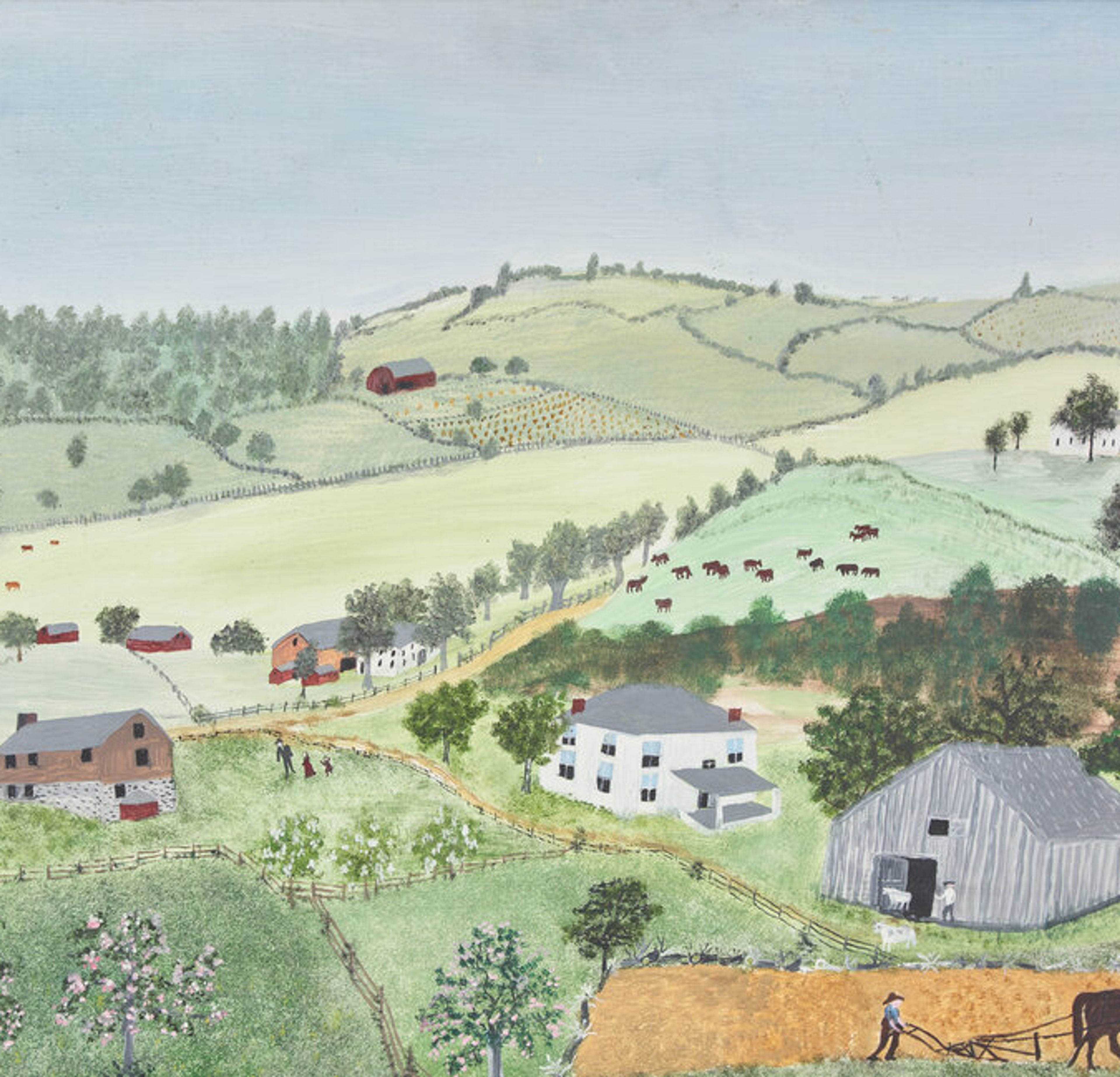
William "Bill" Clifton Buck (1928-2023) was a successful businessman, avid sportsman, and leader within the Philadelphia community. He attended Haverford School, where he excelled in both sports and music. Bill continued his education at Lafayette College, where he majored in Economics. After graduation, he served in the military with the First Philadelphia City Cavalry in Germany during the Korean War and later joined the family business, Smith Kline and French (later GlaxoSmithKline). Alongside his brothers, he founded and expanded The Drug House and later established TDH, a venture capital firm that invested in major companies such as ESPN and Staples. Bill married Laura Thomas (1931-2024) in 1954, and they enjoyed a vibrant 68-year marriage. Together, they were active philanthropists, supporting numerous causes, in Philadelphia, Vero Beach, and Nantucket."Bucktucket," their beloved Nantucket residence, offered an impressive backdrop for both the couple's collection of Nantucket art and ephemera, and Laura's organic cottage garden, a bellwether of the responsible horticulture movement. Given her keen aesthetic eye, Laura was a dedicated member of the Island's Garden Club. Back in Philadelphia, the Bucks actively supported the Philadelphia Museum of Art, the Barnes Foundation, and the Philadelphia Antique Show. Bill's lifelong passion for baseball led him to become a partner in the Philadelphia Phillies in 1981, and he cherished the team's success, including the 2008 World Series win. The furnishings of Bucktucket, a traditional cedar-shake house built by Bill and Laura, and at the couples Villanova residence seamlessly blended their varied interests into an inviting and cohesive aesthetic marked by several spectacular pieces that ail be offered in a single-owner section in the November 19th, American Furniture, Folk and Decorative Arts Auction in Philadelphia. They loved discovering just the right things to fill their homes, meeting artists ant dealers along the way. The Bucks' collection of fine period furniture is anchored by a handsome Federal mahogany tall case clock by Massachusetts clockmaker Aaron Willard (1757-1844). Also of particular interest is a painting by Grandma Moses (1860-1961) entitled Hoosick Hills, which depicts a sleepy town nestled among the rolling hills of upper New York State near the border with Vermont. Maritime art is another strength of the collection, including whimsical works by Ralph Cahoon, ship portraits by Antonio Jacobsen, scrimshaw, sailor's valentines, and English wool-work pictures. Prominently featured is the work of contemporary mixed media shellwork artist Mellie Cooper (born 1949), a mainstay in Nantucket art circles since her early shows at the Sailor Valentine Gallery in the 1980s. The collection also includes ceramics, ranging from Chinese export porcelain to a George Jones majolica sardine box and a high-relief porcelain platter by contemporary maker Maria Superior (born 1951). Additionally, the Bucks sought significant paintings by Impressionists, especially Americans such as Maurice B. Prendergast, Willard Leroy Metcalf, Charles Morris Young, and William Glackens-all to be offered in Freeman's | Hindman's sale of American Art on December 8, 2024. Other standouts include two still life works by French-Vietnamese artist Lê Pho, whose market continues to soar. These examples will star in our inaugural October 28 sale of Impressionist and Modern Art in Philadelphia.
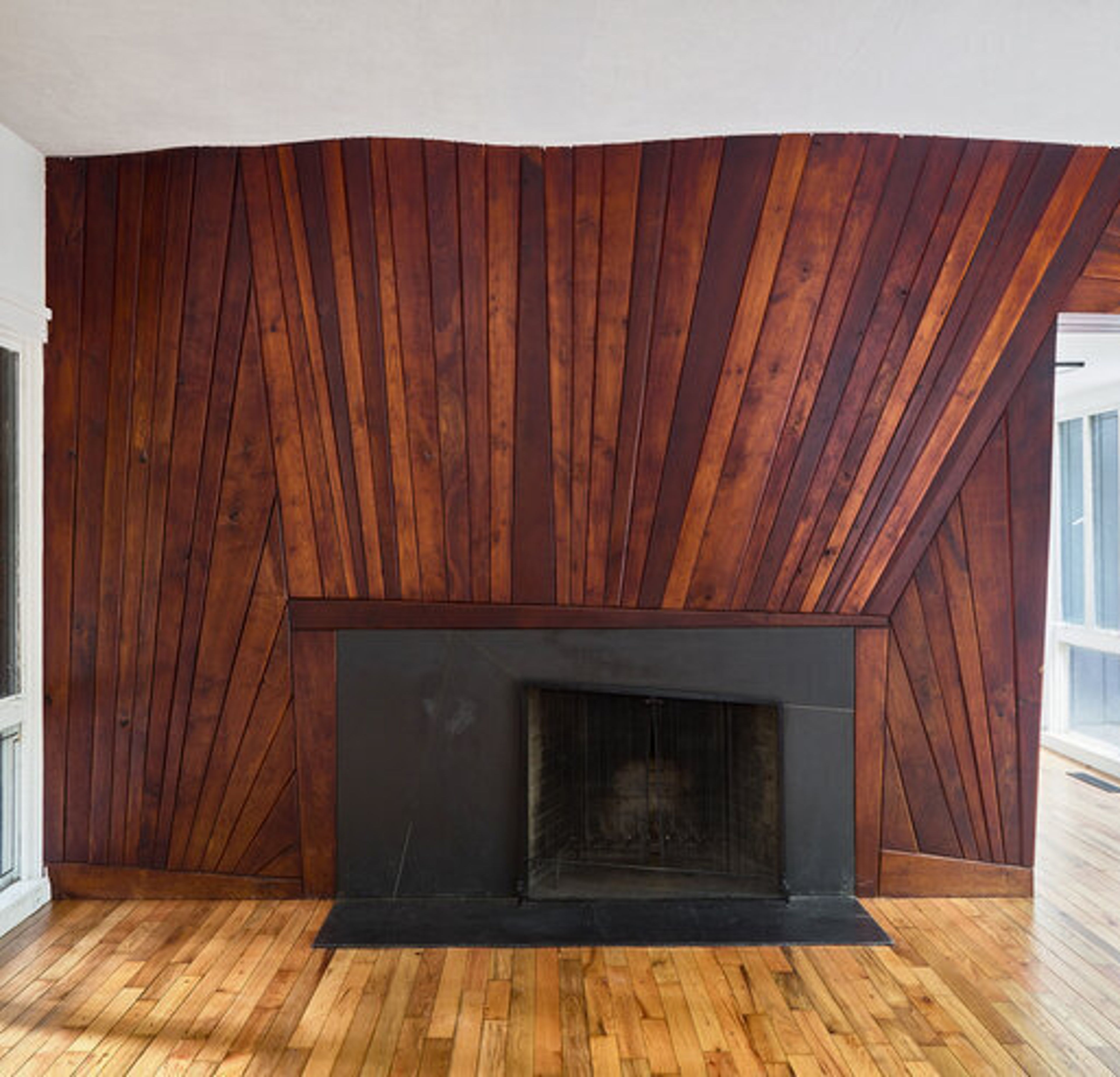
Designed & built in 1954 by architect Elizabeth Hirsh Fleisher, Tulipwood is a house filled with the endeavors of many local artists. Elizabeth was friends with famed wood sculptor and furniture maker Wharton Esherick, who was recognized in his lifetime by his peers as the “Dean of American Craftspeople." She commissioned Esherick to design and build a custom floor-to-ceiling, undulating fireplace to serve as the visual centerpiece of the home. The result was this magnificent wall that spans the entire width of the living room and continues its motif outdoors through a glass window. The alluring depth of color is enhanced by the gradients of tapering walnut, poplar and cherry woods. The radial lines draw the eye towards the fireplace keeping the attention to the hearth and heart of the composition. Three additional lots in this sale from the the Tulipwood property include cabinetry and shelving designed by Esherick for the library as well as wall-mounted cabinets by Paul Evans and Phillip Lloyd Powell. Learn more about the sale here.
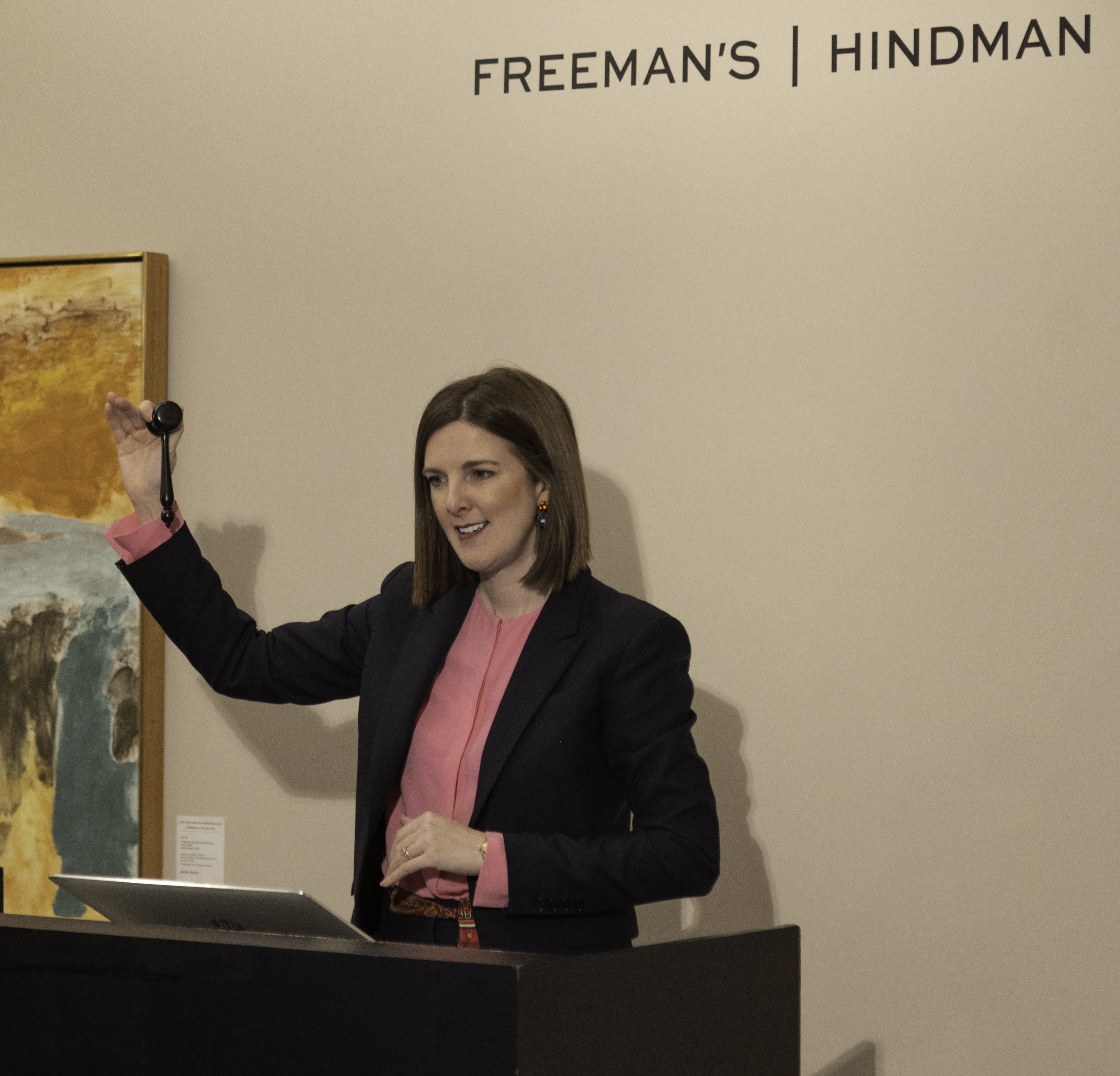
Freeman’s | Hindman’s inaugural Post War and Contemporary Art auction in New York realized an impressive total of nearly $2 million, with standout results for renowned modern masters such as Andy Warhol, Roy Lichtenstein, Helen Frankenthaler, and Alexander Calder. The 23-lot sale attracted over 120 registered bidders from across the globe, with the top lots of the day including Mark Grotjahn’s mesmerizing work Untitled (Violet and Canary Yellow Butterfly 43.78), 2012 and Stanley Whitney’s Stay Song #37, 2019, realizing $647,700 and $215,900 respectively. Gemma Sudlow, Executive Vice President and Managing Director of Freeman’s | Hindman New York on the rostrum next to Indian Dream, 1976 by Friedel Dzuba Speaking to the sale is Aaron Cator, Senior Specialist, Post War and Contemporary Art. “The firm broke new boundaries today by selling key works by artists such as Stanley Whitney, Mark Grotjahn, and Kenny Scharf in a highly focused and high-caliber sale. I look forward to building upon these important foundational successes in the year to come as we position ourselves as a formidable player in the global art market.” Expanding on this growth, Gemma Sudlow, Executive Vice President, Managing Director of the New York Region, states, “Less than a year into our new gallery space at 32 East 67 Street, we are delighted with the results of today’s inaugural sale of Post War and Contemporary Art in New York. Over the last week alone, we have welcomed more than 500 guests - including top advisors, fiduciaries, private clients, AD 100 decorators, and designers - to our galleries in the heart of Manhattan's Upper East Side. The thoughtful presentation of today’s auction and the strong international bidding that it garnered demonstrates our commitment to connecting our regional clients across the United States to the global art market.” Pop Culture Icons Pop culture icons took center stage with works by Andy Warhol and Kenny Scharf emerging as the day's standout pieces. The auction kicked off with Warhol’s Grace Kelly (1984) and Jane Fonda (1982), that achieved $139,700 and $28,575, respectively. The momentum continued with Kenny Scharf’s JUDY JUDY JUDY...AKA JUDY INFINITUM (2013), which far exceeded its $70,000 estimate, selling for $146,050. Featuring Judy Jetson soaring into infinity, this vibrant piece of pop surrealism further solidifies the enduring appeal of cultural icons in the art market. Modern Masters Abstract and landscape works by modern masters captivated bidders, with pieces by Roy Lichtenstein, Albert York, and Helen Frankenthaler exceeding expectations. Albert York’s Untitled (1982), a hauntingly sparse landscape, sparked early bidding excitement, ultimately achieving $76,200 against a $60,000 estimate. Additional standout works came from Helen Frankenthaler and Roy Lichtenstein, whose vibrant, colorful works Relay, II (1976) and La Nouvelle Chute de l'Amérique (the complete portfolio of ten with text by Allen Ginsberg and portfolio case), 1992 realized $76,200 and $82,550, respectively, underscoring the continued market appeal of these iconic artists. Additional Highlights · Lot 4 | Richard Mayhew | Untitled, 2018 | Sold for $38,100 · Lot 18 | Friedel Dzubas | Indian Dream, 1976 | Sold for $69,850 Freeman’s is a premier American auction house offering services in multiple categories including fine art, jewelry, design, books and manuscripts, furniture, decorative arts, antiquities, couture, and Asian works of art. With 16 regional locations nationwide, the firm provides auctions, appraisals, private sales, and art advisory services, connecting clients to the global art market. Freeman’s strives to bring art, history, and design to life by connecting people with extraordinary objects through exceptional service and expertise.
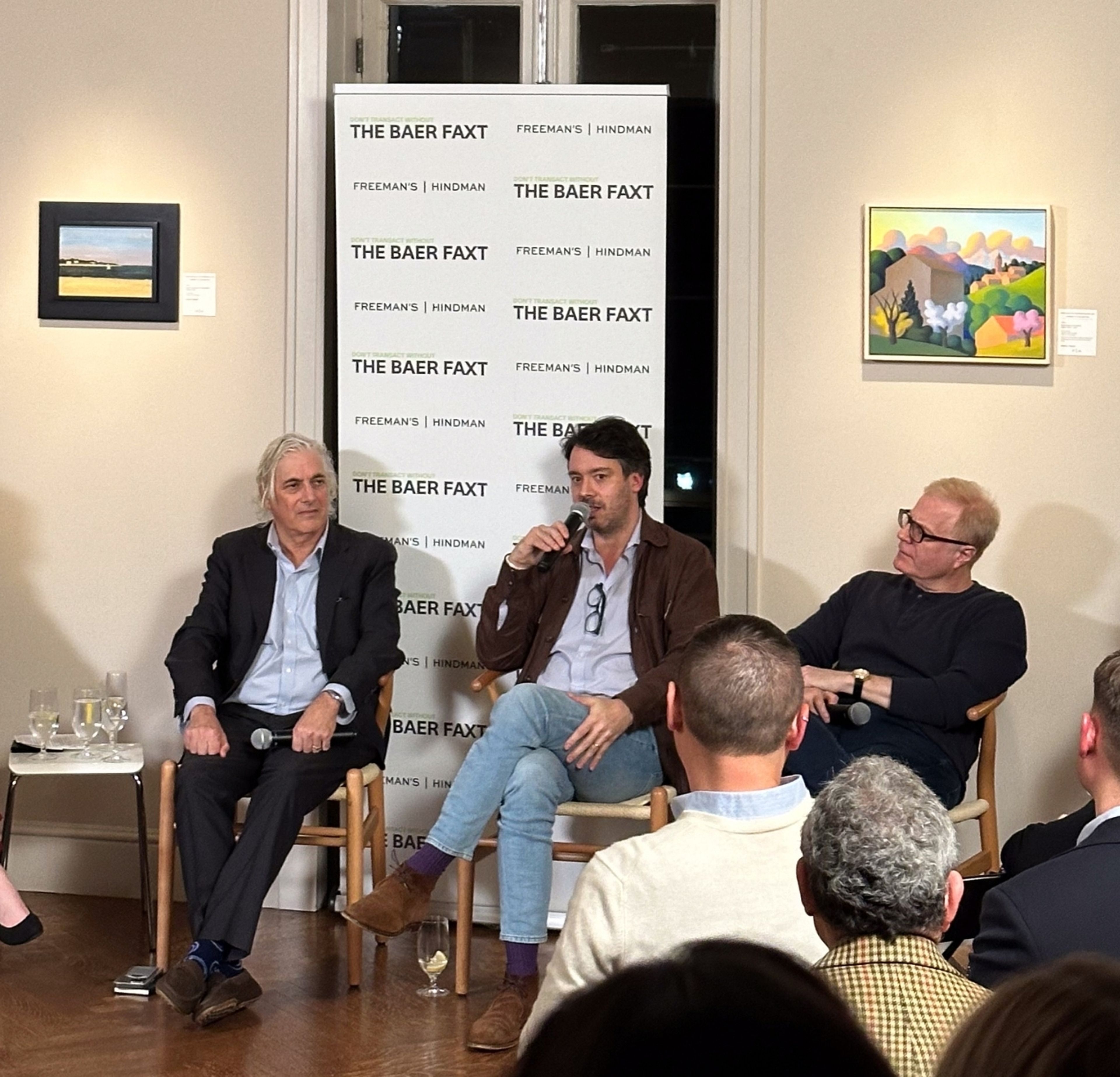
View an insightful discussion with industry experts Josh Baer, Alex Glauber, Todd Levin, and Betsy Bickar, moderated by our very own Gemma Sudlow at Freeman’s | Hindman New York. Dive into the conversation around market trends, the evolving role of art advisors, and what is driving the new generation of collectors. Watch the full panel on The Baer Faxt's YouTube channel and join us as we explore the future of art in an unpredictable market. Freeman’s | Hindman New York’s 2024 Post War & Contemporary Art sale is tomorrow, November 14 at 10 AM ET. Watch here: https://www.youtube.com/watch?v=jPHU_nTAXWE
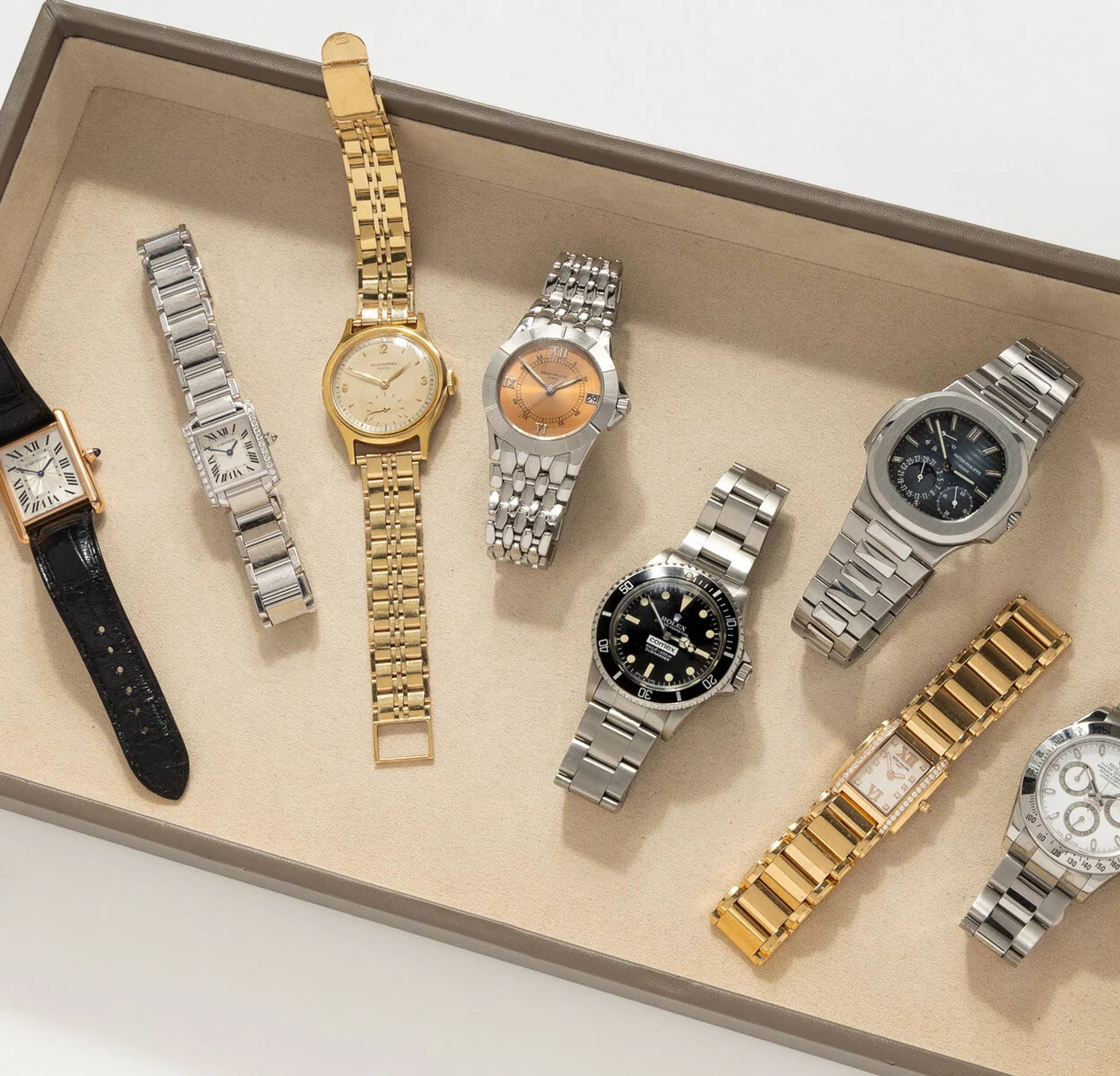
On November 15, Freeman’s invites collectors and enthusiasts to participate in the firm’s premier Watches auction, featuring a selection of highly coveted timepieces.
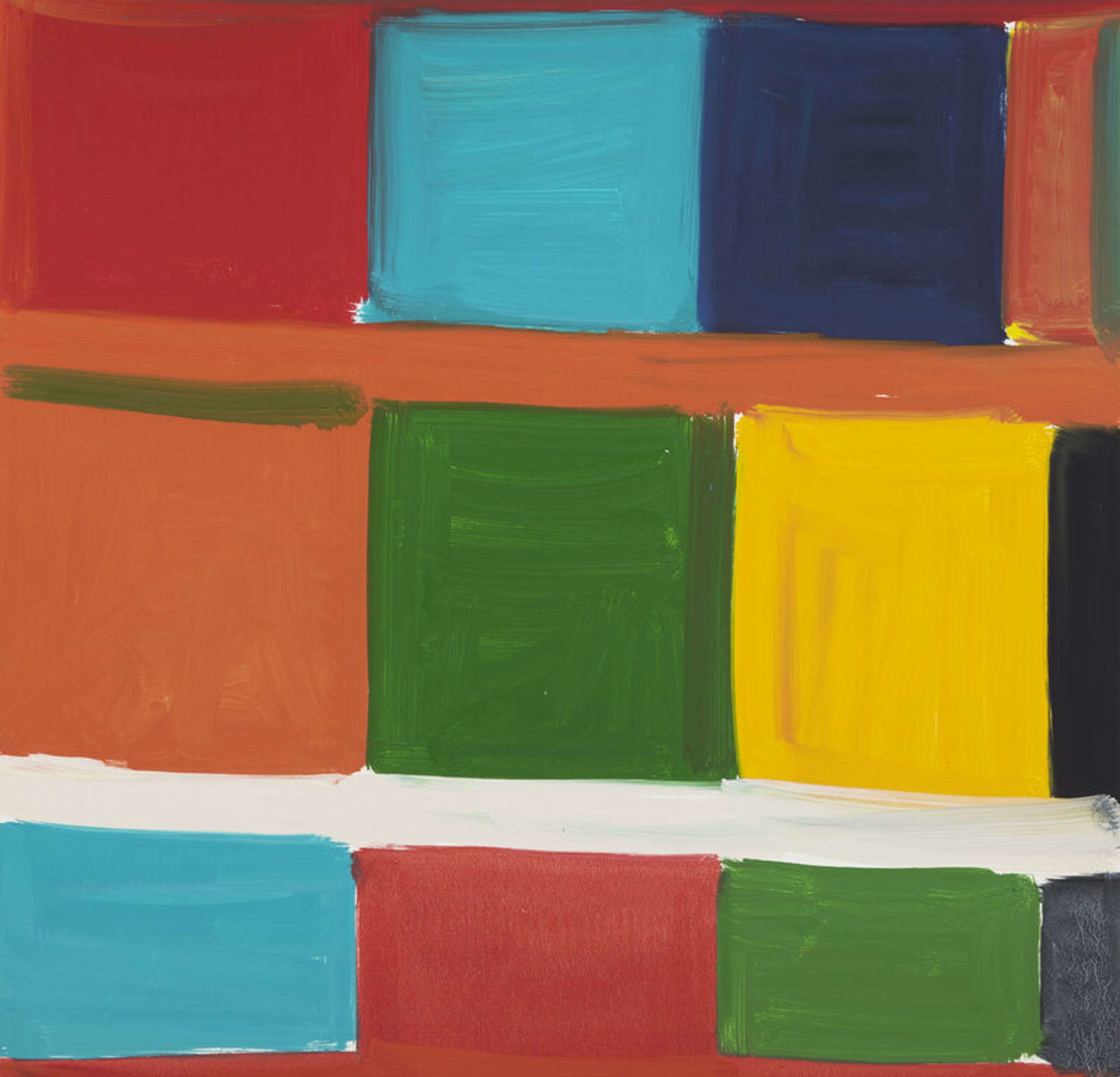
Color holds profound significance for everyone. It evokes emotion, triggers nostalgia, transforms spaces, and fuels artistic creation. Within this realm, Stanley Whitney (American, b. 1946) emerges as a masterful interpreter of color. Renowned for his vibrant color grid paintings, Whitney has established himself as one of the foremost abstract artists of his time, and we are honored to offer one such work, Stay Song #37 (2019). Dancing with vibrant hues of green, blue, red, yellow and orange, Stay Song #37 exhibits the quick, gestural, and spontaneous application of color for which Whitney is known. While he paints, Whitney immerses himself in a soundtrack of experimental jazz, drawing inspiration from artists such as Miles Davis, Ornette Coleman, and Charlie Parker. Here he highlights the importance of music to his work: Music was always there for me as a kind of rhythm—getting in rhythm, having rhythm...The idea of a painting being so still but so rhythmic at the same time. So getting the rhythm of the painting is really important to me; there’s no beginning to it and no end, and I can shift around in it from any one spot. [i] Despite his recent commercial success, Whitney’s path to artistic acclaim was long and challenging. After graduating with an MFA from Yale, he faced considerable obstacles as a black abstract artist in 1970s New York City. This was a time dominated by minimalism—often characterized by a muted color palette—and a prevailing focus within the Black artistic community on figurative works. In this environment, Whitney sought to develop his own distinctive artistic language, one that would eventually diverge from both minimalism and traditional figurative representation. Whitney struggled to find this language for some time. In an interview, Whitney states, “my difficulty was how to make color the subject because the way we were taught is that color supports content.” [ii] It was not until the 90s that Whitney developed the artistic language that would become his signature. After years without any major success in New York, Whitney accepted a position as a professor of art in Rome and moved there with his wife and fellow artist, Marina Adams. His time abroad had a profound impact on the way he interpreted color and space: ... I realized that, for the color not to be decorative, it had to be in the right space...Then when I was in Italy and Egypt in 1992, I understood the last piece was density. Seeing the Colosseum and the Pantheon in Rome and then in Egypt, the pyramids and temples, I realized I could stack the color together. [iii] This realization marked a significant artistic turning point for Whitney, paving the way for the color grid paintings he produces today. He treats color and space as one, creating an immersive experience for the viewer—a dynamic interplay where each hue interacts with its neighbor, generating a visual rhythm. The loose, geometric grid serves as his sole blueprint, while his application of color relies entirely on intuition. In conversation with colleague and artist David Reed, Whitney describes his process or, perhaps more accurately, his lack of a fixed process: The only system I have really is top, middle, and bottom. Even if I wanted to make a red painting, I couldn't do it. I have to let the color take me wherever it takes me. Sometimes I paint little paintings...and I go, oh, I can turn this into a big painting. But then I can’t do it because I have to be totally open to wherever the painting takes me. The idea that color cannot be controlled and that it has total freedom. One color can’t overpower another color, you know. [iii] As seen in the strong blocks of color in Stay Song #37, where cooler blues and greens confront deep reds, orange, and yellow, balancing the three-tiered grid through streaks of white and black, Stanley Whitney is an artist who is unabashedly unafraid of color. This technique dictates the dialogue within his work, and not only challenges conventional perceptions of abstraction but also invites viewers to engage with art as a living conversation. Bibliography: [i] Whitney, Stanley, and Leri, Louise. “The Space is in the Color.” Gagosian Quarterly. https://gagosian.com/quarterly/2020/04/10/interview-space-is-in-the-color-stanley-whitney-louise-neri/ [ii] Stanley Whitney, interviewed by Adrianna Campbell, “New York, New York,” Artforum, July 14, 2015. [iii] Whitney, Stanley, and David Reed. “Stanley Whitney.” BOMB, no. 123 (2013): 38–46. http://www.jstor.org/stable/24365406.

American artist Vic Payne (b.1960) demonstrates a remarkable ability to capture the spirit and essence of the American West through his artwork. His focus on themes such as cowboy culture, the natural world, and Native American history resonates with both traditional Western art enthusiasts and contemporary audiences alike. Payne's work showcases a meticulous attentiveness to detail and a strong sense of place, reflecting the history and mythology of the West. In his monumental work, Braveheart, the artist depicts a Native American man who reaches out towards a soaring eagle to snare the mystical bird and his coveted feathers. Eagle feathers are considered sacred and were often used in important cultural practices, such as prayer, healing, and the building of a war bonnet. To capture an eagle, however, was a challenge even for the savviest hunters. Lore tells us that the Native Americans had one clever, albeit unconventional method, to trap an eagle, which is shown in the present sculpture. Donning the pelt of a wolf, this warrior lured the eagle to him, only to surprise the bird and meet him in hand-to-talon combat. Braveheart is a dynamic, action-filled sculpture that showcases Payne’s technical skill, eye for composition, and appreciation of Native American culture.
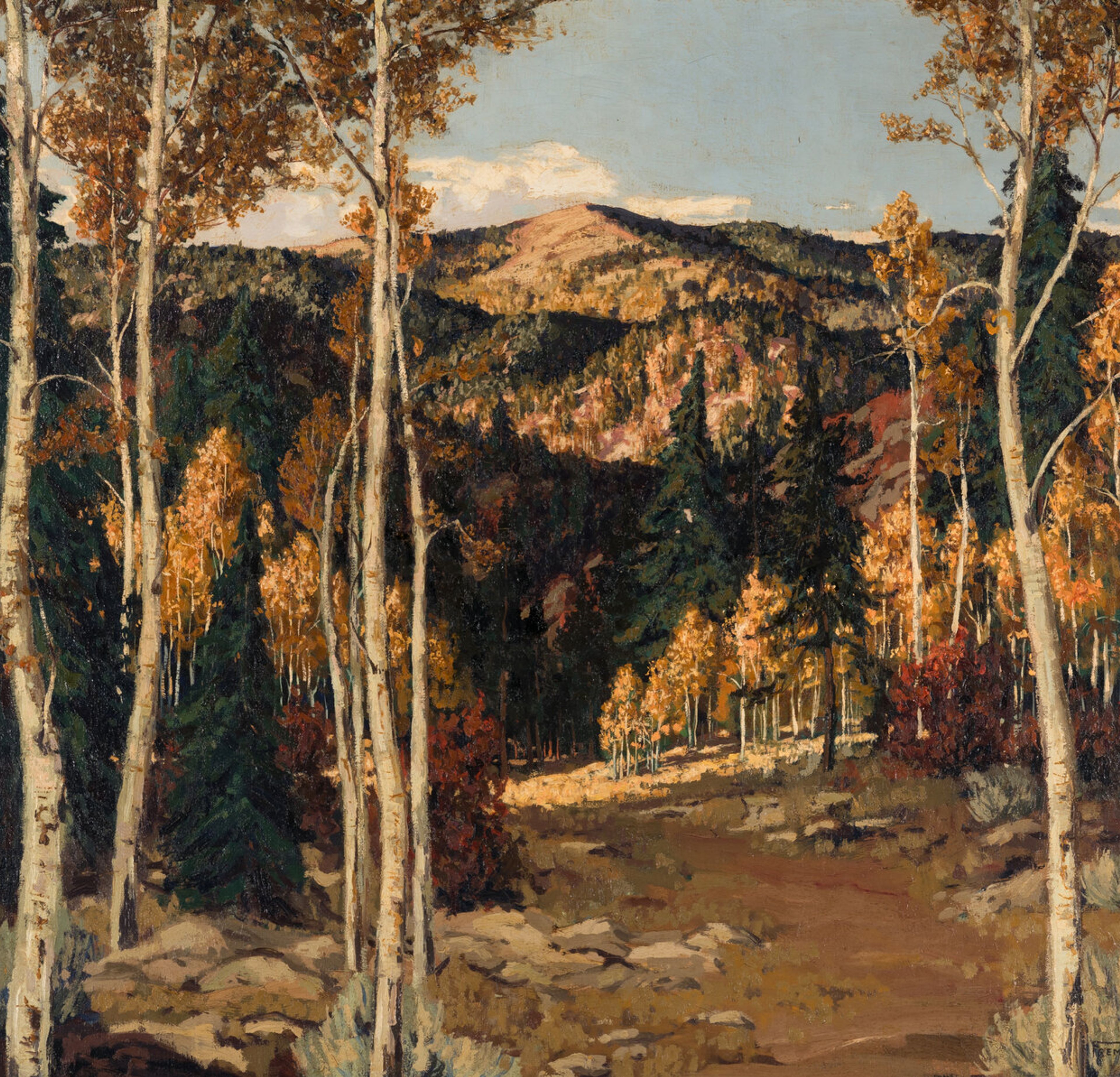
A Montana native, Fremont Ellis settled in Santa Fe, NM, in 1919, and in 1921, was a founding member of Los Cinco Pintores, a group of modernist artists also including Josef Bakos, Walter Mruk, Will Shuster, and Willard Nash. Ellis distinguished himself from his peers by a less avant-garde approach, relying instead on techniques borrowed from both realism and impressionism, as well as the photographic medium. October Aspen evinces visual accuracy through a masterful portrayal of natural light, bathing peaks and recesses in the mountainous landscape in the background, while also spotlighting the aspen in the foreground with their subtly varied autumn shades, as if capturing a fleeting moment in time. The composition further subjugates the gaze to the heights surrounding Santa Fe through an opening amidst the trees, thereby guiding and immersing the viewer in the grandeur of the landscape.
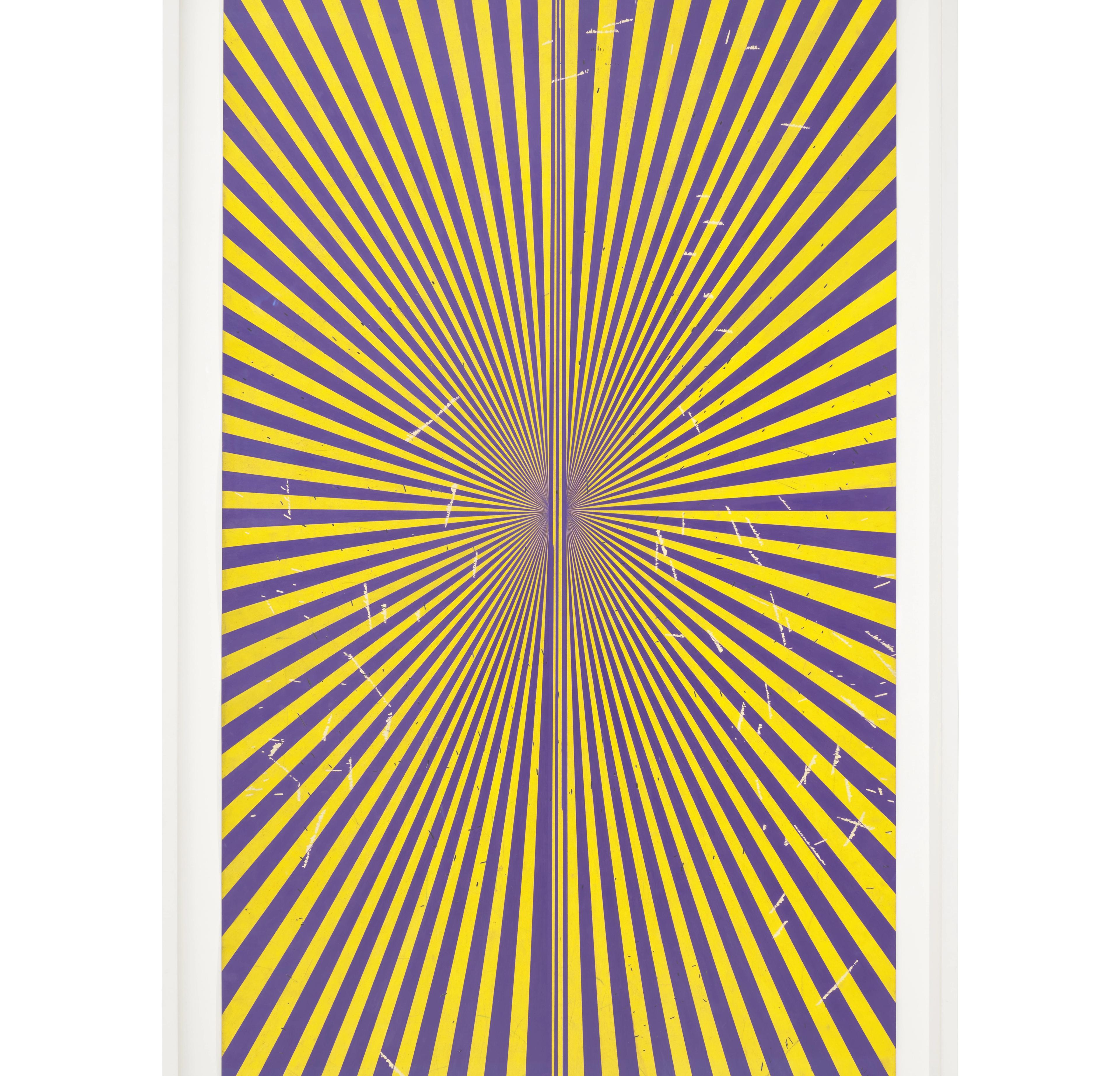
Mark Grotjahn’s Untitled (Violet and Canary Yellow Butterfly 43.78), 2012 belongs to a series of large-scale paintings and drawings the artist began in 2001, investigating varying and multiple-point perspective and engaging vibrant color in new ways in each work in the series. The focal point here, as in his other series of “Perspective Drawings” serves as an anchor for work that is as much about process and chance as it is a careful study in abstraction. In an interview at the time of his 2010 exhibition at the Portland Art Museum, Grotjahn explained: “I changed the focal points because it changed the composition of the works and found that it was visually interesting and worthwhile… the only problems I was trying to solve were visual ones.” Often Grotjahn repeats forms within a series like Butterfly, working through similar shapes, perspectives and effects by employing different colors, often later exhibiting the works together. Their grand scale encompasses the viewer, occupying the whole visual field, something that critics have compared to the effect of Mark Rothko’s painting. The large-scale drawing on offer here, with its rich canary yellow and violet tones, reverberates in the viewer’s eye, creating a pulsating effect that draws the eye up and around and through, but also directly to the worked surface and its materiality. Born in 1968, Grotjahn studied at the University of Colorado at Boulder before completing his MFA at the University of California, Berkeley. In 1995, he was an artist-in-residence at the Skowhegan School of Painting and Sculpture in Madison, Maine. He moved to Los Angeles in 1996, opening an art gallery called Room 702 there with classmate Brent Petersen, an experience that gave him particular savvy into the art market. Though the gallery closed after only two years, it provided Grotjahn an opportunity to work closely with fellow artists and promote their work. Continuing his involvement in the art community in Los Angeles, he served as an artist trustee at the Museum of Contemporary Art, Los Angeles from 2014 until February of this year. Mark Grotjahn’s work is included in the collections of the Whitney Museum of American Art, New York, the Museum of Modern Art, New York, the Walker Art Center, Minneapolis and the Museum of Contemporary Art, Los Angeles.
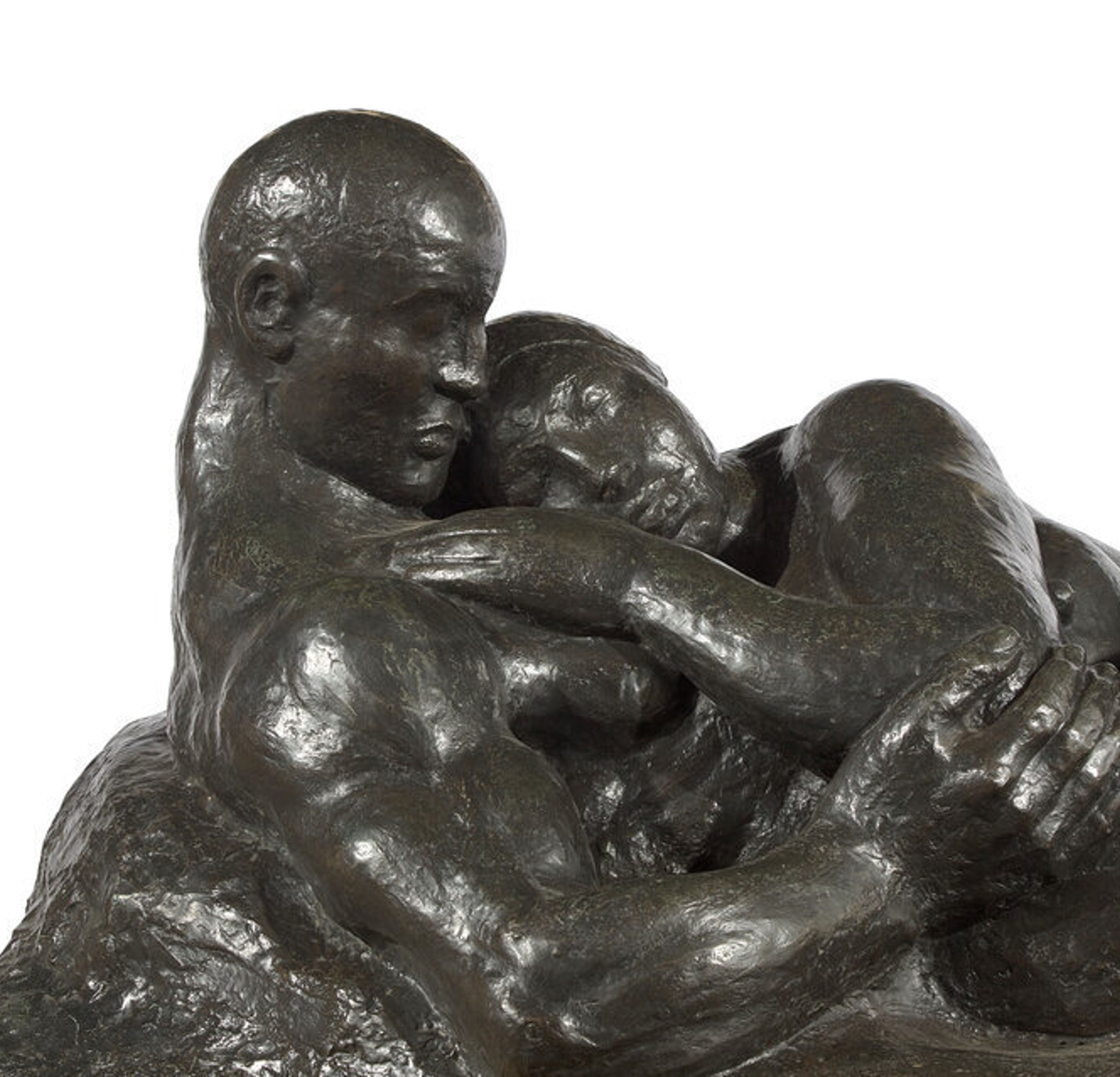
This season, Freeman’s Hindman is very proud to introduce at auction, and throughout three different sales, several bronzes by Gaston Lachaise (many of which are fresh to market) from an important family collection in New York. Ranging in size and years, they provide a unique opportunity to rediscover the distinctive style of the French-born Master, once considered to be one of America’s best living sculptors.